


Sheppard Robson’s redevelopment of a PFI hospital in Essex aimed to maximise views for patients. But how did it square this rather pricey ambition with the need to keep costs down?
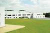
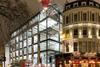
Cost is never far from the decision-making process when it comes to building a PFI hospital. And the £21m redevelopment of Brentwood Community Hospital in Essex is no exception. So how has the design team managed to get away with a building envelope that is a third larger than the most efficient conventional design?
The redevelopment replaces a thirties building with a facility that is twice the size. According to Jason Speechly-Dick, design director at Sheppard Robson, the typical response would have been to pack it all together in a tight cluster of buildings to make the most economical box. “At competition stage we knew our competitors would do a compact building, so we took the decision that the design would win this one and went for a more radical approach.”
What drove it was the desire to create a building that would promote patient rehabilitation. One of the main aims was to bring as much daylight into the 8,500m2 floor area as possible and maximise the views across the grounds and surrounding woodland.
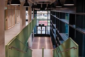
Sheppard Robson’s response is a collection of buildings with relatively shallow floor plates that follow the arc of the site’s sun path to capture maximum daylight. Cupped within the crescent is a garden that is overlooked by the maternity ward, the day hospital and the children’s ward. “We put the people on the perimeter where they can benefit from the daylight and the circulation and support facilities in the centre of the building where daylight was less critical,” says Speechly-Dick.
Everyone has access to a view, even the radiologists who might be more used to occupying dark bunkers in hospital basements. “Recruitment and retention is an issue and providing good quality working spaces helps,” says Helen Bunder-Smith, the project architect. Typically, the floor layout comprise a 4.8m wide room on the north side, a 2.2m central corridor and a 8m perimeter ward.
Perhaps surprisingly, having such a long and thin building didn’t affect circulation unduly. Brentwood is a community hospital which incorporates in-patient and out-patient facilities in five distinct departments including a rehabilitation ward and a women’s and children’s unit. But these departments are virtually independent of one another and, apart from sharing some central resources, could almost stand alone as separate buildings.
The site also worked in the design’s favour. A fall of 11m from east to west has allowed the building to be stacked to three storeys at one end. “It’s a simple concept,” says Speechly-Dick. “The power is in the plan. If you get this right, everything else tends to fall into place.”
However, the scheme needed to stack up financially. Three options were considered at the design stage. The first was a four-storey “stacked box” approach using deep-plan floors that gave 38% of the rooms access to a view and daylight. The second was a three-storey reticulate finger design, where 54% had the view. The third was the two and three-storey crescent-shaped building you see pictured here where the figure reached an impressive 78%.
The drawback with this approach was cost. Compared with a compact building, it had considerably more surface area and was therefore more expensive. To overcome this the design team had to come up with a building envelope that was as cost-effective as possible.
To get the cost down, money normally set aside for curtain walling and special features such as double-storey atrium spaces and glazed links was instead put towards a simpler system that could be used for almost the entire envelope.
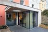
A flat-slab insitu concrete frame construction was adopted which would give the flexibility of putting openings wherever they were needed in the facade. The answer for the envelope was a wall system that comprises 100mm dense blockwork with a 6mm white acrylic render on 60mm of insulation on the garden side which gives a visual imitation of a thirties modernist style.
On the street side, 100mm-wide Western red cedar planks fixed to battens replaces the render. “The residents thought that a hospital twice the size of the old one would bring down the value of their homes. This drove the use of the wooden cladding on that side of the building to help it blend in with the existing mature trees,” says Speechly-Dick. An aluminium double-glazed stick system that is polyester powder coated was used in small areas.
Despite the higher surface area of the “crescent” building, Speechly-Dick says they were able to manage the cost by also targeting the M&E services. “We worked hard to get the plant room sizes down – 30% in places – and minimise the length of the service runs, while the flat insitu concrete building frame also lends itself to easier fixing of the services.”
This two-pronged attack has worked and Speechly-Dick says he’s proud of the results. And while the layout wouldn’t work on every site, it makes the most of this one.

The options considered
Option A The “box” scheme: three storeys with floor plates 50m deep, a building envelope of 2,900m2 and a 2,800m2 roof area
Option B The “fingers” scheme: three storeys with a 20m-deep floorplate, a building envelope area of about 3,400m2 and 2,800m2 roof area
Option C The “crescent” scheme: two storeys, 14-to-18m-deep floorplates, a building envelope area of about 3,900m2 (made up of 1,700m2 insulated render and 2,000m2 timber cladding) and 4,000m2 roof area.
Specifier 13 March 2009
- 1
- 2
- 3
 Currently reading
Brentwood Community Hospital: Operation sunlight
- 4
- 5
- 6
- 7
- 8
- 9
- 10
- 11


No comments yet