They might not have the glamour of new-build, but refurbishments, such as this one at Castle Hill school in Kent, have their wow factor too - nowhere more so than on price. Ike Ijeh sums it up
The collapse of ║┌Č┤╔ńŪ° Schools for the Future has sounded the death-knell for the era of lavish public spending on the UKŌĆÖs school rebuilding programme. It is already clear that whatever replaces it in these austere times will need to assume a different economic and political form.
BSF, with its reliance on convoluted new-build procurement, was perceived by many as wasteful and inefficient. Although the exact nature of its replacement is not clear, economic factors will be paramount. All of which suggests that the schools sector may be poised for the strategic domination of one particular renewal method: refurbishment.
Refurbishment of school buildings has often been considered the poor relation of new-build. It is viewed by many as a cost-driven remedy that compromises design quality and dilutes the unity of the schoolŌĆÖs built fabric and its architectural vision. Furthermore, refurbishment is often subject to structural and environmental limitations, which in turn need large contingencies in the budget that offset, or even eradicate, the cost savings that are its main benefit.
However, consider the case of Castle Hill Community School, a two-storey, 350-pupil primary in Folkestone. In 2005 it was in crisis. It had been placed in special measures by Ofsted, and it exhibited all the signs of underperformance: academic results were poor, staff morale was low and accommodation was inadequate and inefficient.
Five years later, as the school prepares to reopen for its autumn term, this picture has been transformed. Its SAT results have soared, its intake has increased, the teaching environment has been enhanced and the school plays a big role in the local community. And all this from a refurbishment budget of ┬Ż3.7m. Furthermore, this figure represents a reduction of almost 20% on the original budget and has been estimated to be just over half of the new-build cost required to deliver the same quantity of accommodation. How did Castle Hill do it?
The answer is grounded in the pragmatic approach employed by the design team, which was able to deliver a cost-effective solution that remained faithful to the original brief and design vision. Castle Hill therefore presents itself as a topical and seductive case study that could well become a template for other schools.
Demolition always wastes energy and materials. for us, keeping some of the existing fabric is an ethical and environmental approach
Paul Briner, Guy Hollaway Architects
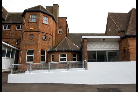
Castle Hill is an amalgamation of extensions added over 100 years. Its red brick Victorian core is the oldest part and exhibits the bay windows, pitched roofs and gable-ends that are typical of the period. Subterranean air-raid shelters were added in the forties, utilitarian extensions in the sixties and a further large extension (the Hartwell block) in the nineties. The most recent wing was completed earlier this year as part of another refurbishment completed by local practice Guy Hollaway Architects.
Before the refurbishment took place, the result of all these add-ons was a hotchpotch of independent structures tacked onto and around the Victorian building. The school hall, for instance, occupied an entirely separate block and could only be reached by braving the elements.
This diversity is also reflected in the range of academic models the school provides.
As well as the primary school, it offers classes for pre-school children, a Sure Start facility and a unit for children with hearing difficulties.
A competition was launched for a design that would consolidate all the physical elements of the school into a coherent whole. This was won by Guy Hollaway Architects (apart from the Sure Start building, which was completed by other architects). A major part of this strategy was also to ensure that the hearing impaired unit (HIU), formerly housed in a separate block, became more physically and socially integrated with the rest of the school. These ambitions formed the core of a strategic vision that came to define the entire refurbishment project.
From the start the client, Kent council, opted for refurbishment rather than rebuilding. Project architect Paul Briner says this presented opportunities. ŌĆ£The cost saving to the budget was probably the overriding benefit but sustainability was another. Demolition always wastes the energy and materials inherent in the building, regardless of how much is recycled. So for us, keeping some of the existing fabric is an ethical as well as environmental approach. We also wanted to be honest about the history of the school: itŌĆÖs a new environment, but itŌĆÖs not a new school.ŌĆØ
This conceptual distinction went on to inform the design the architect came up with. The proposals included the demolition of some buildings, the renovation of what remained and the addition of an extension. Both the Hartwell extension and the Victorian core were retained, largely because they were structurally sound. A separate reception wing was built to the east of the site, connected to the Sure Start centre. Two playing fields were created beside them.
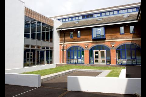
Most of the sixties accommodation - which included the separate school hall building - was demolished. This was primarily driven by the need to rationalise circulation space and to create a quadrangle at the heart of the school.
This area replaces a one-storey sixties block that suffered from dog-leg corridors and windowless internal rooms.
The quadrangle cleverly combines the current vogue for hub spaces in educational buildings with the collegiate character of Oxford and Cambridge. A central circulation corridor - or in the typology of the quadrangle, an enclosed colonnade - runs around three sides of this courtyard and increases the efficiency of the floorplan by linking the Hartwell and Victorian blocks to the new extension.
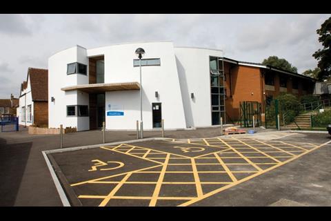
The extension contains a top-lit, double-height main entrance lobby, library, conference room, IT suite, self-contained staffroom and a school hall. The hall is a barrel-vaulted space linked to the main building by an internal bridge. This compartmentalisation satisfies the security and access requirements that allow the hall to be made available for community use outside school hours.
The overall vision for the refurbishment was to create a strong sense of unity within the teaching environment. One of the most significant ways this is achieved is the relocation of the HIU from a separate block into upgraded rooms on the ground floor of the Victorian block. The nature of its teaching demands a design that achieves certain technical standards. These include acoustic attenuation measures to reduce reverberation, and extensive mechanical ventilation to ensure that windows can remain shut to prevent the intrusion of background noise. To ensure no part of the school would be inaccessible to the pupils in the HIU, suspended ceiling panels were installed throughout the building to ensure conspicuously lower reverberation levels in most areas as well as visual uniformity.
Briner maintains that it was no harder to adapt the Victorian building to meet these requirements than it was to achieve them in the extension. ŌĆ£Of course there were certain features that were problematic,ŌĆØ he says. ŌĆ£ItŌĆÖs harder to achieve the required acoustic performance with exposed brick walls and there were inherent problems with damp, moisture and insulation, all of which had an impact on the budget. But itŌĆÖs about adopting a flexible and creative approach to resolve individual problems on a case-by-case basis.ŌĆØ
One area where this approach was compulsory was the budget. Construction was split into two phases. The first involved construction of the school hall and reception building and the second saw completion of the extension and the renovations to the upgraded HIU. The phased approach meant that staff and pupils could be moved to corners of the building, rather than being decanted off-site, during construction. The construction cost at phase one had been set at ┬Ż4.5m. By phase two this had been reduced to ┬Ż3.7m.
The reduction made possible by the innovative and creative responses from the design team across the site. The steel-frame, brick-and-block construction employed on phase one was switched to timber frame for phase two, the mechanical ventilation planned for the hall was largely replaced by a roof-mounted wind-vent passive stack system and the glazed rooflight demarcating the diagonal axis on which the new extension was aligned was discarded.
However, Briner argues that none of these savings were delivered at the expense of quality, and that they forced the design team to devise more imaginative solutions to ŌĆ£design issues outŌĆØ. This approach is evident throughout the school. In the HIU, standard kitchen units have been shrunk to child-size by simply slicing off the top drawer ends rather than buying bespoke versions.
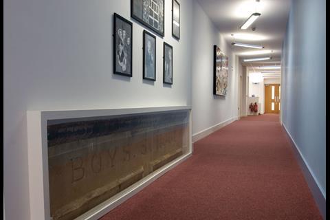
An aluminium window initially discarded because it had been cut to the incorrect dimensions was salvaged and installed to admit borrowed light into an internal office. Cloakrooms for younger children double as one-on-one break-out spaces. And although the interior of the Hartwell block remains largely untouched, simply painting its corridors the same shade of blue as used in the extension achieves the visual unity that was one of the core ambitions of the brief.
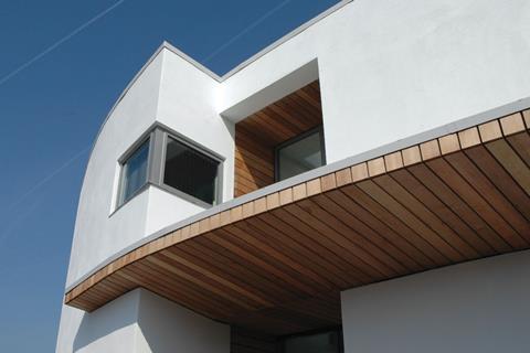
Although these elements unify the interior, externally, the architect has made no attempt to camouflage the fact that the extension is architecturally and historically distinct from its neighbours. Clad entirely in white render, its elevations form a striking contrast with the red brick of the Hartwell and Victorian blocks on either side. Moreover, its curvaceous form, timber-clad canopy and reveals, linear fenestration and extruded sheer walls provide a starkly modernist aesthetic that again boldly distinguishes it from the surrounding facades.
Its style is reminiscent of a seafront context as well as appearing strangely yet reassuringly residential. This level of intuitive intimacy is rare on a building type as utilitarian as a school, and emphasises the unique role the extension plays in constructing the whole. The segregated nature of refurbishments dictates that this balance is always difficult to achieve.
Unsurprisingly, Briner is insouciant about the demise of BSF. ŌĆ£Too complex, too many people and too much centralised power,ŌĆØ he says. ŌĆ£Improving schools is about effective communication and close working relationships at a local level.ŌĆØ
The cost-effective pragmatism pursued so rigorously at Castle Hill certainly provides an antidote to the excess with which BSF was associated. Significantly, it also proves conclusively that taking the refurbishment approach need not compromise design quality and vision.
Refurbishment also enabled the character and spaciousness of the schoolŌĆÖs Victorian rooms to be retained, while showing that historic fabric can be adapted to satisfy even the most specialist technical requirements. And crucially, the innate sequential nature of refurbishment projects arguably places them in a better position than new-builds to absorb the kind of budget cuts that were levied at Castle Hill between phases 1 and 2.
But Castle Hill tells us something even more. Its key conclusion is that a projectŌĆÖs chosen construction route is secondary to its design ethic. And as the design ethic employed at Castle Hill was grounded in an open and pragmatic approach, it was flexible and resilient enough to respond to the multiple challenges a complex project of this nature inevitably presents. The result is a successful architectural response to the strategic vision identified at the start of the project - to stitch and repair a disjointed physical fabric into a unified and enhanced teaching environment. And itŌĆÖs a ringing endorsement of the refurbishment approach.
- Remodelling Education Spaces is a two-day conference and exhibition on the refurbishment of schools, colleges and universities. Visit for free and get access to top suppliers, seminar sessions and key industry stakeholders. Register at
Project team
Architect Guy Hollaway Architects
Client Kent council
Main contractor GSE Design & Build
Structural and civil engineer Gary Gabriel Associates
M&E engineer and QS GPM Partnership
Downloads
Before refurbishment
Other, Size 0.11 mbAfter refurbishment
Other, Size 0.22 mb










No comments yet