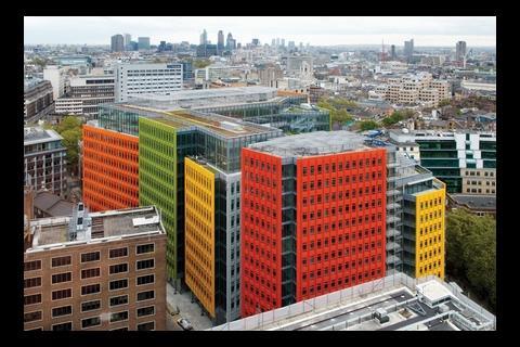
Controversial it may be, but Central St Giles has cheered up an obscure corner of London with a riot of reds, yellows, greens and oranges ŌĆō making the rest of the capital look a tad grey.
Up until the completion of Renzo PianoŌĆÖs first finished UK building this month, St Giles, a tiny, bizarrely obscure district in the heart of central London, was renowned for making only two unfortunate contributions to popular culture: leprosy and alcoholism (see box, ŌĆ£Gin and tonicŌĆØ, overleaf). But now, cast in glorious technicolour and rising directly opposite the historic Angel pub on St Giles High Street, Central St Giles offers the area the tantalising chance of redemption.
The site is just yards from Richard SeifertŌĆÖs landmark sixties Centre Point tower and directly opposite Henry FlitcroftŌĆÖs Palladian church, St Giles-in-the-Fields. Owned by Legal & General and Mitsubishi Estates and developed by Stanhope, Central St Giles replaces a grim fifties Ministry of Defence block affectionately referred to by project architect Maurits van der Staay as ŌĆ£the bunkerŌĆØ.
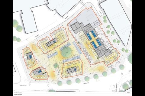
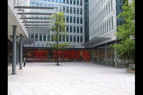
The new mixed-use development comprises 405,000ft2 of office space in a horseshoe-shaped 11-storey building. One hundred and nine flats, approximately half of which are affordable, are to be found in a separate 15-storey block on the siteŌĆÖs western edge. Between the two buildings and right at the centre of the site, a public piazza has been formed, surrounded by 24,500ft2 of ground floor retail and restaurant space.
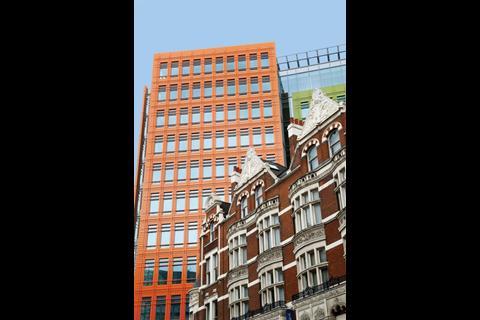
Whereas the ground floor areas are enclosed by large expanses of clear glazing set behind flanks of concrete columns, it is the elevational treatment applied to the upper floors that gives the buildings their distinctive appearance. The external perimeter facade of the building is broken up into no fewer than 13 vertical colour-coded panels, with a further eight lining the inner courtyard.
The intention is to break down the mass of what is a very large block by articulating it as a series of ŌĆ£fragmentsŌĆØ rather than a single whole. This segmentation is a pursuit that has defined many of PianoŌĆÖs large buildings from BerlinŌĆÖs Potsdamer Platz to the Shard, whose very name is derived from the vast sheets of glass that are to be overlaid onto its surface.
A series of vertical recesses sliced into the facades subdivide the main panels and help further diminish the buildingŌĆÖs mass. On strategic corners these recesses are expressed as shafts of winter gardens, which, it is anticipated, will eventually be filled with greenery to act as naturalistic relief to the buildingŌĆÖs rigidly rectangular form.
The coloured facade panels themselves are composed as a tight grid of identical window bays. The only variation takes place on the residential block where window sizes are adjusted to accommodate the reduced floor-to-ceiling heights. Commendably, both tenures of housing, private and affordable, are indistinguishable externally.
The panels consist of 134,000 prefabricated glazed terracotta tiles hung, according to Mike Knowles, project director at Stanhope, ŌĆ£by an internal chassis carrier system and as a decorative veneerŌĆØ. Simon Wilkes, head of development at L&G, expects the tiles to be ŌĆ£durable and practically self-cleaningŌĆØ and that they will retain their distinctive colours ŌĆ£foreverŌĆØ.
Since the external envelope began to emerge from its scaffolding in 2008, it has been impossible not to notice the development because of its striking colours. Van der Staay admits that from the start the architects wanted ŌĆ£bright and bold colours but ones that were also natural and worked well
with each other as well as with surrounding trees and brickworkŌĆØ. Hundreds of colour options were explored and a full-size panel mock-up erected on site before the final six were chosen.
The schemeŌĆÖs hefty visual impact has aroused considerable public interest ŌĆō not all of it positive. Never before has London been treated to such a frenzied orgy of reds, yellows, greens and oranges. When viewed from either near or far, the contrast with the traditional London grey/brown of the surrounding townscape is both surreal and cinematic.
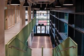
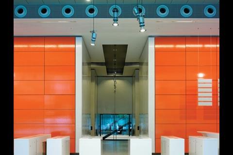
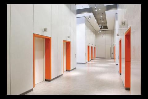
Throughout, the building is exquisitely detailed with PianoŌĆÖs trademark fluency and precision. The castellated steel mullions on the glazed and setback upper attic storeys are particularly elegant. Colour and materials are also enthusiastically embraced internally to provide visual consistency. Lift door reveals are formed by the same orange glazed terracotta tiles used externally, and elements such as handrails and even lift digital displays are rigorously colour co-ordinated.
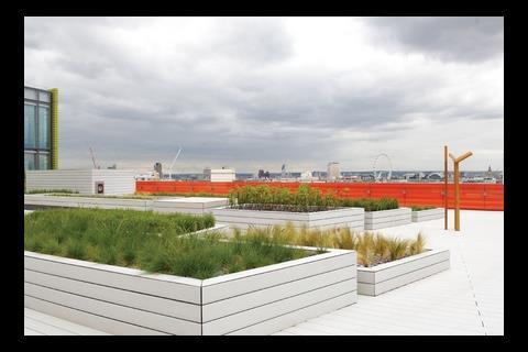
With a generous internal height of 2.9m, the internal office spaces feel exceptionally light and spacious while upper floors offer spectacular views and generous landscaped roof terraces. The gulf between the quality of office accommodation provided by Central St Giles and that of Centre Point next door ŌĆō itself symbolic of an earlier generation of commercial redevelopment yet one that remained empty for several years after completion ŌĆō could not be wider.
But there is much more at stake here than public or critical reaction to a garish colour scheme and crisp detailing. St Giles is an area almost unknown to many Londoners, despite being sandwiched between the far more glamorous addresses of Covent Garden, Soho, Bloomsbury and Holborn.
The architects have made great efforts to create a transparent, well integrated public space that drastically improves local connectivity and achieves a superlative synthesis between architecture and public realm
Its severance from LondonŌĆÖs urban fabric and social consciousness has been exacerbated by the labyrinthine one-way gyratory system imposed by post-war traffic planners, which has led the neighbourhood to become the West EndŌĆÖs equivalent of the Twilight Zone.
The arrival of Crossrail and the extensive reconstruction of nearby Tottenham Court Road tube station promise better things to come. As do Central St GilesŌĆÖ extensive section 106 agreements which will provide several improvements to the local public realm. These will include tree planting along St Giles High Street and ŌĆō eventually ŌĆō the redevelopment and partial pedestrianisation of Princes Circus, a fractured helix of
one-way roadways and inaccessible traffic islands directly east of the site. So as well as making a bold architectural statement, the development clearly aims to raise the profile of the area and repair the disjointed urban fabric of its surroundings.
Does it succeed? The answer is a resounding and unequivocal yes. And its principal mechanism for doing so is the joyous new public space at its heart. When private developers locate ŌĆ£publicŌĆØ spaces at the centre rather than along the edge of their site, the implicit suggestion is often that they are seeking a managed, mono-cultural environment where the spontaneous activities central to public life can be controlled.
However at Central St Giles, although scores of masterplan configurations were explored, Van der Staay maintains that the central square option was the most effective in ŌĆ£minimising the impact of traffic noise and fumes from St Giles High Street and avoiding the unreasonably large and inefficient floor-plate that would have been generated by an edge or corner public spaceŌĆØ.
The architects have made extraordinary efforts to create a transparent, well integrated public space that drastically improves local connectivity and achieves a superlative synthesis between architecture and public realm. The rapport between the two is largely thanks to huge panes of low ion extra clear glass that plunge views deep into and right through the building ŌĆō views enhanced by the remarkably generous 7m ground floor ceiling height. The result is that even in the centre of the square, the surrounding streetscape is still visible at ground level, seamlessly harnessing the new space into its existing context.
Also, by aligning the squareŌĆÖs multiple entry points to the grain of local streets, (particularly Denmark Street) the square acts like a geometric pivot from which a series of local vistas and axes radiate. This is contextual architecture at its very best.
Above ground level, however, the results are less successful. Unlike the multi-coloured perimeter facades, the internal elevations facing the square are all finished in grey. Van der Staay explains that this decision was taken to ŌĆ£ensure that the upper storeys did not detract from the transparency of the ground floor and to maximise the amount of light reflected back into the officesŌĆØ. However, the result is a rather ponderous uniformity that contradicts the vigour of the outer facades and represses the contextual diversity so eloquently achieved at ground level.
Within these upper storeys of the square and on the perimeter facades, it also becomes clear that just one window bay type has been repeated endlessly across the entire building. This modular regularity may well appease the modernist ideology PianoŌĆÖs work clearly subscribes to. But the effect, once again, is monotonous, shrouding the development in a homogenised straitjacket whose ability to relate to the variety of context and streetscape that surrounds it is severely compromised. For a building of this scale and for one that goes to such extravagant lengths to conceal its size, this uniform response remains a curious and disappointing anomaly.
The success of St Giles will ultimately be measured by its ability to attract commercial tenants and its impact on the surrounding public realm. Negotiations with prospective occupiers are under way and although no deals have yet been finalised, L&G maintains that ŌĆ£strongŌĆØ interest has been generated. With its planned amenities, generous piazza and eye-catching design, the development will undoubtedly seduce the media and advertising companies that populate the area and prove an attractive place in which to live, work and visit.
And what of its impact on the public realm? Well, here the answer is two-fold. Although the design team is to be congratulated for resisting the temptation to propose a high-rise solution, (particularly when former mayor Ken LivingstoneŌĆÖs hazy ŌĆ£guidanceŌĆØ identified the area as ŌĆ£appropriateŌĆØ for tall buildings), Central St Giles is a big, bulky block in a neighbourhood characterised by a far more modest urban grain. Its uniform elevations, sculpted envelope and psychedelic camouflage do little to assuage concerns about overdevelopment.
And yet its bold colours, however controversial, do give the scheme a strong identity, in contrast to the tepid monochrome monoliths of so much of LondonŌĆÖs contemporary commercial architecture. And they are central to the real triumph of the development: its skilful construction of a new urban identity for a forgotten area and the generosity of its ground level engagement with context.
Perhaps the most poignant indication of the impact Central St Giles may have on the areaŌĆÖs wider regeneration is that the old Angel pub opposite, cultural barometer of the areaŌĆÖs fortunes, is being refurbished. From the start of the project Renzo Piano stated that he did not want his building to take ŌĆ£selfish possession of the siteŌĆØ. From the perspective of a historic pub and a superb central square at least, this humble aspiration has been masterfully realised.
Gin and tonic
Back in 1101, Queen Matilda founded a leper hospital and colony at St Giles, unwittingly bestowing a social stigma that has plagued the neighbourhood ever since. And the colloquial term ŌĆ£off the wagonŌĆØ ŌĆō referring to an alcoholicŌĆÖs resumption of drinking ŌĆō was coined when condemned inmates from Newgate Gaol on their way to execution at Tyburn gallows, (now Marble Arch) were briefly allowed off their prison carts for a final drink at the local Angel Inn pub.
Gin Lane, HogarthŌĆÖs famous depiction of drunken debauchery in 18th century London, was also set here and further reflects the extreme dissipation and deprivation that has historically blighted this former slum district.
The refurbished Angel pub and the new bars and restaurants planned for the piazza will help reinvigorate an area still looking distinctly down at heel.
Engaging the Community
The St Giles Renaissance Forum was established in 2002 by Legal & General at the start of the development process.
Its brief was to provide a means by which local residents and stakeholders, assisted by architect John Thompson & Partners, could work together to formulate a ŌĆ£Vision for St GilesŌĆØ.
The organisation brought various local community groups such as the Bloomsbury and Covent Garden ResidentsŌĆÖ Associations together with the local authority, Transport
for London, Crossrail and the Central St Giles design team. One of the ideas tabled was lobbying London Underground to
rename Tottenham Court Road tube station St Giles Circus.
Simon Wilkes, head of development at Legal & General, maintains that the forum played a ŌĆ£crucialŌĆØ role in helping secure planning permission and that he would have ŌĆ£no hesitationŌĆØ about repeating the process on future projects. ŌĆ£Local people actually got up to speak in support of the scheme at the planning committee meeting, after which several votes changed in favour,ŌĆØ he says. ŌĆ£Without that thereŌĆÖs a real chance we might not have gained permission.ŌĆØ








No comments yet