With the National Tennis Centre in south-west London, Hopkins Architects has taken a lumbering and guileless building type and instilled in it the grace and finesse of a Roger Federer. Martin Spring admires the architect’s all-round game
In an age when computer-aided design drives architecture into ever-more frenetic acrobatics of blobs, spikes and teetering walls, here is a building that shows how modern architecture can still have grace, finesse and an easily grasped design logic.
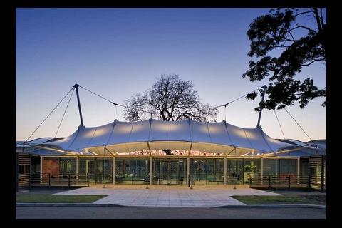
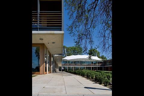
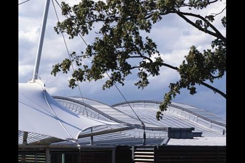
The £21m National Tennis Centre is a ground-hugging rectilinear building that stretches out beneath soft, saddle-shaped roofs in its parkland setting of Roehampton, south-west London. The gently curving roofs are a perfect counterpoint to the two storeys below, which take the form of a regimented series of clear-glazed rectangular bays overlaid by horizontal timber louvres.
The building displays the pure pedigree of Hopkins Architects. Its design is distilled in the less-is-more tradition of Mies van der Rohe rather than revolutionary, as it contains elements recycled and adapted from earlier Hopkins buildings. The long, low, consistently glazed building embracing a prominent fabric structure can be traced back to Schlumberger’s research centre in Cambridge, which the firm designed in 1982.
That said, enlightened architectural concepts that are second nature to Hopkins break the mould when applied to the specialist building type of indoor tennis centres. Natural daylight is introduced to the indoor courts; the inward-looking courts are wrapped within gymnasiums and visitor bedrooms that add human scale and activity, and the building settles gracefully into its parkland setting.
At the same time, the architecture goes well beyond that required for a tennis centre. The basic three-dimensional form of the main indoor tennis court wing, for instance, has been neatly recycled into an exhilarating office wing alongside it.
The National Tennis Centre has been developed by the Lawn Tennis Association (LTA), the UK’s governing body for the sport, and its £21m cost largely comes from profits from the annual championships held at nearby Wimbledon. The 17ha site forms part of the Bank of England’s existing staff sports ground. The LTA’s vision was to provide “world-class facilities and support” to nurture future British champions.
As recollected by Bill Taylor, Hopkins’ managing director, the LTA’s design brief was for a “shop floor” for top-level tennis training. “They wanted people always to be aware of tennis going on around them,” he says.
“That’s why we configured the building like this, with the main entrance above the restaurant and near the middle. It allows Tim Henman and Andy Murray to rub shoulders with promising school kids on training courses. It breaks down barriers.”
The profile of the roof is determined by the trajectory of a tennis ball. It creates interesting spaces
Bill Taylor, Hopkins Architects
The basic design problem was how to reconcile the technical demands of indoor tennis with a sensitive site at the edge of Richmond Park and within a metropolitan open area. The tennis requirements had the effect of raising the roof to accommodate a ball in full flight, whereas the sensitivity of the site meant the building had to be squeezed down to make it less obtrusive.
To resolve the conflict of heights, Hopkins has sunk the 10,000m2 building into the site’s natural slope. All that is visible of the two-storey building from the approach side is the glazed upper storey and three soft roofs, two in light-grey zinc and the third in white fabric, curving gently overhead. The reception hall beneath the fabric roof looks down on the other side to a grassy double-height courtyard that is closed off by a majestic 400-year-old sycamore tree.
The six indoor tennis courts and two-storey open-plan office wing on either side of the reception hall are also recessed by one floor. The effect is that the visitor arrives at a higher level, and can take in the whole interior at one glance.
The dimensions, environmental conditions and surface materials of indoor tennis courts are all largely dictated by established LTA regulations. Taylor puts it more poetically when he says: “The profile of the roof is determined by the trajectory of a tennis ball. It creates interesting spaces.”
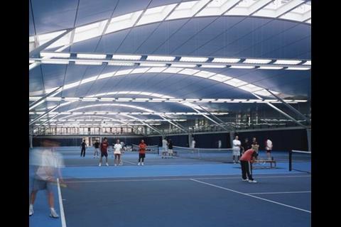
A strict application of the regulations would have resulted in a pedestrian, double-pitched portal-framed structure spanning 40m. However, with the help of Arup as structural and services , Hopkins has moulded this into a soft curving vault that beds down to wide horizontal stretches on either side.
The vault is not supported on lattice arches over its 36.5m clear span, as might have been expected, since these would either project down into the proscribed tennis ball trajectory or raise the roof profile even higher. Instead they are supported on simple curved I-beams of just 540mm in depth.
What look like the vestiges of trusses at either end are actually diagonal steel props.
The roof arches are positioned at either side of each court, where they are paired 2.76m apart. Along its top edge, each 2.76m gap is glazed as a continuous roof light. This funnels daylight onto the tennis courts, although diffuse glazing and the depth of the beams shields players from being dazzled by sunlight and glare when they look up.
The centre allows Tim Henman and Andy Murray to rub shoulders with promising school kids on training courses. It breaks down barriers
Bill Taylor, Hopkins Architects
Whereas indoor tennis courts habitually languish in lifeless, fluorescent lighting, the carefully controlled daylight at Roehampton introduces a changing sense of the outside world. And, as Taylor adds, daylight also brings the practical benefit of adding visual modelling, which helps players to keep their eye on the ball hurtling through the air.
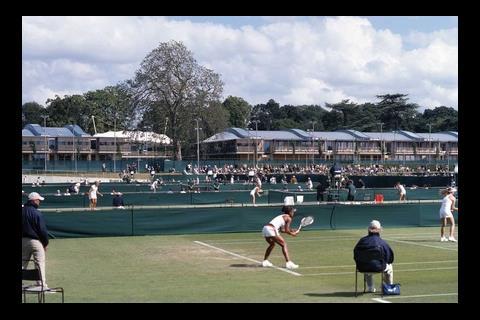
The six indoor tennis courts have been sandwiched between narrow two-storey banks of rooms on either side. Along the entrance side are a gymnasium, rehabilitation area and medical centre, while overlooking the open-air tennis courts at the rear there are 27 bedrooms with en-suite bathrooms for visitors on training courses.
The two-storey office wing, which houses the LTA’s administrative staff as well as its tennis coaches, reproduces the basic form of the indoor tennis wing. It has the same 55m depth, the same saddle-shaped roof and two of the same strip rooflights. The differences are that the wing is only 22.5m wide to induce natural through-ventilation, which brings the two rooflights closer together, and the four primary roofbeams are propped by inconspicuous vertical columns rather than by diagonal props.
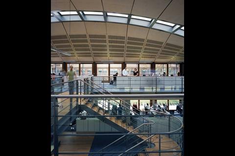
Even so, the last thing the office wing looks like is a recycled indoor tennis centre. Its open-plan, double-storey interior offers an exhilarating sense of space, daylight and sweeping views. It has a strong self-contained presence created by a shallow dome rising above a double-height central arena with an open staircase rising up through one end. At the same time, it offers unobstructed views right across the wing that bring in both floors simultaneously, and then beyond the floor-to-ceiling perimeter glazing to the surrounding parkland. The perimeter walls are made up of glazed sliding doors that occupants can open for fresh air or to take a breather on the balcony.
The three-sided courtyard beyond the reception hall has the same footprint as the office wing and an equally strong presence, thanks to its comfortable proportions and the glorious sycamore tree towering over it towards one end. It serves variously as a garden to the restaurant, an open-ended cloister with a covered walkway beneath the projecting upper floor, and an amphitheatre overlooked by the glazed upper floors and balconies on three sides.
Finally, no Hopkins building can be visited without commenting on the finesse of the materials and detailing. Although it was procured through a design-and-build contract awarded to ISG Interior/Exterior, the National Tennis Centre is no exception to this Hopkins rule. And that is despite the timber gridshell structure of the initial design being value-engineered into steel beams, and the green patinated copper roof ending up as light-grey zinc.
The fairface in-situ concrete is well up to Hopkins standards. As well as the concrete and clear glass, the dominant material here is another tactile Hopkins favourite – unfinished timber. It has been used for the hefty floor-to-ceiling sliding doors to the external balconies and for the chunky louvres that make up the brises-soleil.
Basic western red cedar was specified, but top-grade sections were selected and robustly dimensioned to emulate a more upmarket hardwood such as American oak. The timber also ably reflects the building’s parkland setting.
The National Tennis Centre brings a rare architectural distinction and human spirit to a building type that is habitually constrained by sporting regulations. It also shows that, in the right hands, applying the principles of modern architecture can produce an elegance that is perhaps more prized than ever in an age of freeform computer-aided design.
Downloads
Cross-section
Other, Size 0 kbEntrance-level plan
Other, Size 0 kbTypical roof vault over tennis court
Other, Size 0 kb
Postscript
For more project images, search









1 Readers' comment