The renovation of the University of Sussex’s arts centre transforms the space beyond an education facility to a fully fledged performance venue, addressing acoustic and flexibility issues along the way without tampering too much with Sir Basil Spence’s 1960s design. Ike Ijeh reports. Photography by Jim Stephenson
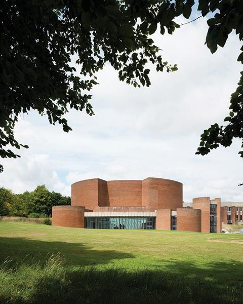
In many ways the University of Sussex is similar to the various university campuses built in cities such as Exeter, Warwick and York in the rapid university expansion programme that took place in the UK during the 1960s. The peripheral suburban sites occupied by all these institutions allowed modernist architects the freedom to carve out their vision of an ideal utopian environment without the inconveniences of context and heritage presented by the historic cores of their eponymous cities.
Sir Basil Spence, architect provocateur of the 1960s and 1970s architectural establishment, designed several university buildings during this period and his trademark brutalist flourishes are evident on the sprawling squadron of hulking brick and concrete buildings that constitutes his Sussex campus.
But Sussex differs from many of its contemporaries in one key measure: it was one of the first modern universities to have its own dedicated arts centre, a fixture that is now relatively common today. Perhaps in recognition of this accolade, for Sussex’s arts centre Spence created a truly extraordinary building quite different from the rest of his campus.
Gone are the concrete arches and regimented impenetrability that characterises Spence’s work both on the rest of Sussex campus and elsewhere. Instead he created a wonderfully enigmatic brick structure whose solid turrets, curved walls and even small moat bestow the whimsical appearance of a medieval keep or a prehistoric Stone Age encampment. Even though the centre deploys the same brand of militaristic defensiveness that is a common feature of the campus’ architecture, it exudes this with a simple, monolithic charm that makes it one of the most wistful and virtuoso examples of all Spence’s works.
Today the grade II*-listed building has undergone a radical £7.2m refurbishment carried out by RHP Architects that has increased its usable space by 33%. In recognition of one of its major benefactors, the centre has been renamed the Attenborough Centre from its original title of Gardiner Centre.
It now boasts a state-of-the-art 350-seat auditorium, extensive gallery and display areas designed for art and audio visual installations, rehearsal studios, breakout zones and a new café and bar. Crucially, it also enables the centre to evolve from a purely university institution into a joint commercial operation that can offer amenities and productions to both students and the public. As centre manager Matt Knight explains, “the big, but interesting challenge of the project was to upgrade this from an educational facility to a performance venue.”
But of course these new facilities were not always in place and delivering them has been at the crux of the refurbishment project that has seen the centre closed since 2007. Opened by the Queen herself in 1969, the centre was initially hailed as a showpiece of contemporary theatre design but functional and environmental constraints, worsened by prolonged underinvestment, quickly became evident.
By the time of its closure, acoustics in the main auditorium were woeful, seating was unsafe and inadequate, the auditorium itself retained an inflexible layout which severely limited production capabilities, much of the external brickwork required urgent repair, internal space generally was severely constricted and access was poor.
Accordingly, Dave Sweeney, associate project architect at RHP, summarises the refurbishment approach: “At its very core we strove to deliver two key things: accessibility and flexibility, everything else we did stemmed from that.”
Exterior
Externally, the building is virtually unchanged, with the exception of remedial cosmetic work to the brickwork and some of the concrete parapets, as Sweeney explains. “Generally the brickwork was in very good condition. But all the brickwork has been re-pointed and any brickwork staining has also been cleaned. Where necessary concrete parapets have also been repaired with new cavity trays and damp-proof coursing added. But the essential character of the exterior has been retained throughout.”
Repairs to the brickwork required a canny militaristicx of old construction and new technology. The original brickwork mortar was a traditional lime mortar mix. By its nature, lime mortar may appear soft and crumbly with low compressive strength, but it retains remarkable elastic chemical qualities that enable it to bond incredibly well to new compatible mortars and also provide the high vapour permeability necessary to keep brick walls dry.
Conversely, the method used to clean the brickwork was a highly sophisticated piece of modern technology. As Sweeney explains, a “low pressure, high temperature steam system quite literally sucked out all the dirt without causing any harm to the brickwork itself”.
While the majority of the exterior appears as curved solid brickwork, there are occasional glazed openings, the principal one being a dramatic sweep of faceted glass that faces into a former gallery space now converted into a bar. This, along with all other windows on the building has been replaced with contemporary versions that retain the same aesthetic but with far higher environmental performance.
As with several 1960s buildings, only single glazing was originally installed – a feature that led to appalling thermal problems internally. However, the windows, with the slimline frame proportions, fared far better aesthetically. The original manufacturer was the famed Essex glazer Crittall whose products were featured on many landmark examples of English modernist and Art Deco architecture. The double-glazed replacements retain the sleek proportions but upgrade environmental performance to modern standards.
Foyer
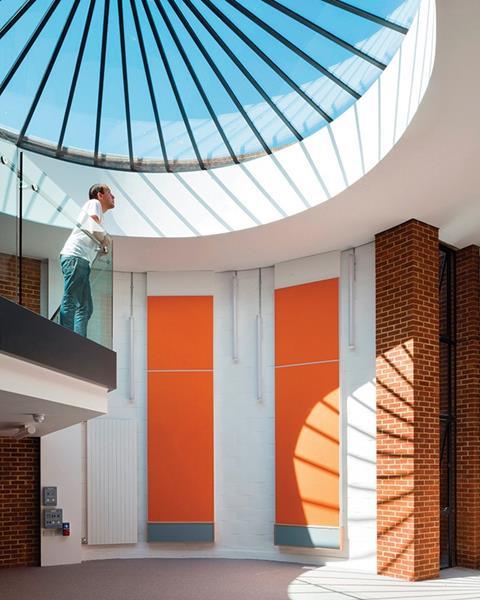
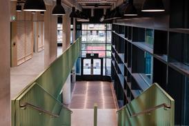
Internally, the same theme of retaining the character of the original architecture remains but here, the new interventions, while still subtle, become more evident. At first glance, the foyer, with its tiled paviors and brick and concrete surfaces, remains unchanged.
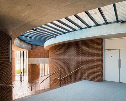
But a closer glimpse reveals that new glazing, this time in the form of rooflights, have been carefully added. The foyer is bathed in a welcome surfeit of natural light that defies the solidity of the exterior. Much of this is admitted through a single sprawling curved rooflight. Previously, this was a gloomy opening spanned with dull, opaque glass and Georgian wire.
By replacing this with clear glazing subdivided with aluminium mullions that span radially from the curvature of the adjacent walls, the new scheme stays true to the geometry of Spence’s original work while admitting significantly more natural light into the space below.
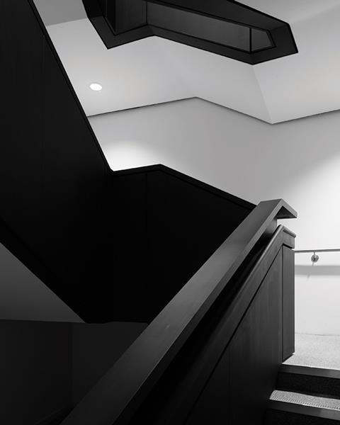
Accessibility, one of the core facets of both the client brief and architectural concept, is also immediately evident inside the building. A wide sweep of foyer stairs that lead up to the auditorium has been subtly appended with sleek bronze balusters.
And most significantly, a new glass lift opens on to the foyer and provides level access to all floors of the building for the first time. The lift now occupies half the width of a short flight of steps which leads up to the new bar. Sweeney reveals that the lift shaft is only glazed at its foyer opening “to retain transparency into the new bar/former gallery area which was a heritage concern”. Cleverly, the new concrete wall that separates it from the adjacent steps has been finished with the same board shuttering Spence applied to all concrete within the building.
This similar theme of careful and sensitive remediation continues throughout the building. The new bar has been replastered in white as per its previous gallery incarnation and offers spectacular views out towards the surrounding richly landscaped grounds.
Other areas, such as the rooms and offices inserted into the distinctive circular towers, have also been similarly refurbished with whitewashed walls, reglazed skylights and discreet panel heating. Throughout the building the new design does an impressive job of keeping the substantial new wall and ceiling-mounted plant and services infrastructure cleverly concealed away from view.
Auditorium
Of course the final substantial component of the refurbishment is the auditorium itself. “The original vision for this space was for a fully flexible theatre-standard venue with multiple stage configurations and world-class acoustics,” explains Knight, “but for various funding and design reasons, that was never really the case.”
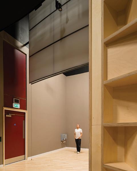
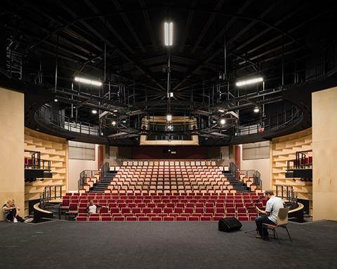
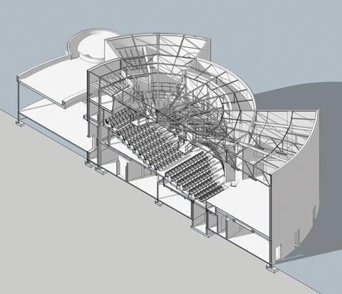
The architectural challenge was to belatedly deliver that vision by creating a fully flexible venue. The design attempts to achieve this by installing new retractable seating and an entirely new stage floor capable of multiple configurations on different levels, as Sweeney explains.
“The new floor and seating allows multiple stage configurations ranging from thrust stage to catwalk to theatre in the round. Further iterations are introduced when the seating is entirely retracted into the bleachers to create a standing-only music venue when necessary.” At full seated capacity the auditorium can accommodate 350 people, but an additional 150 can be added with the seating removed.
But as well as flexibility, the other major flaw with the auditorium was poor acoustics, a hindrance the new design also addresses. “The acoustic principle was to have as many non-absorbent surfaces as possible,” reveals Sweeney, “to ensure that the sound is reflected rather than amplified, which leads to distortion.”
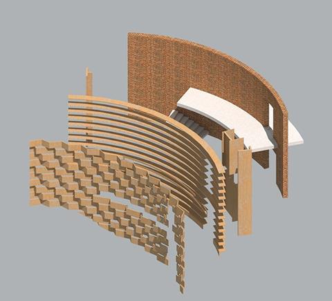
While Spence’s original plywood wall battens to the upper levels of the auditorium have been retained, the new acoustic strategy is architecturally realised by the two large plywood balcony wall panels fixed to either side of the auditorium. Their surfaces comprise a series of almost deconstructivist angles and points devised to deliver the multiple hard surfaces required to deflect sound.
Acoustically even the plywood bases of the new seating perform the same role. And aesthetically the new wood theme is complemented by a new plywood frame fitted around the control room right at the back of the auditorium’s upper level.
To the casual observer and certainly from the outside, it looks as if little has changed on Spence’s enigmatic little rotunda. But of course behind this familiar visual conceit lies the true success of any conservation project, to provide the facilities and specifications that satisfy modern standards but within a visual framework that retains original character and stays true to the architect’s initial intention. It is a difficult balancing act to achieve, particularly on architecture as uncompromising as Spence’s. But it is a tightrope that spans the theoretical core of all conservation and it is one that has been skilfully and subtly walked here.
Project Team
Client University of Sussex
Architect R H Partnership
Main contractor Kier Construction
Structural engineer Arup
M&E engineer TUV SUD
Project manager Gardiner & Theobald
Cost consultant Capita
Acoustic consultant Sound Space Design
Day 2 of the Ecobuild 2016 show will be all about architecture, and will now feature the awards. Clear for the latest updates and conference programme.

Learn more about this topic at the ‘Future of commercial development’ session at this year’s �ڶ����� Live event on 26 November. For more information and to book tickets go to:







No comments yet