Heneghan Peng’s £25m refurbishment of the National Gallery of Ireland is a sensitive and sometimes almost invisible intervention into an idiosyncratic building. Ike Ijeh reports on a project that brings light and coherence to a complex site
The recent snap general election result has brought the issue of austerity sharply, if rather unexpectedly, back into focus. The infamous spending review of October 2010 endures as a grim watermark for the UK cultural sector, as it saw central arts funding cut by a massive 30%. This had an obvious constraining effect on major cultural projects in the country and brought to an end a post-Millennium era marked by a near-unprecedented cultural largesse that delivered seminal national projects such as Tate Modern and the British Museum Great Court.
But austerity did not just clip the wings of major public cultural works in the UK. The Irish banking crisis of 2008/09 left the country susceptible to swingeing funding cuts and by 2012 arts funding in the republic had fallen to just 0.1% of GDP, 0.5% below the European average for the same year and even lower than the UK level of 0.4%.
Only one major cultural capital project survived the cull: the redevelopment of the National Gallery of Ireland. And now, after a six-year refurbishment period where over 80% of the venue’s galleries were closed to the public, the comprehensively revamped gallery has reopened. The completion had been timed to coincide last year with the 100th anniversary of the 1916 Easter Rising against British rule, but a series of unforseen structural issues prompted a delay.
So is the final result worthy of being the only show in town?
Approach
The £25m project has been designed by Dublin-based Heneghan Peng architects, currently completing the world’s largest archaeological museum, the gigantic Grand Egyptian Museum in Giza. But this project – standing in the heart of Dublin’s historic city centre and involving four distinct but interconnected wings, two of which are Victorian – is an altogether more intimate and sensitive project that seeks to balance conservation and renewal. While a new courtyard space and entrance lobby has been created, there has been no external alteration, and the vast majority of the project involves the refurbishment of internal galleries.
The oldest two of the gallery’s four wings have been completely refurbished. These are the Dargan and Milltown wings, completed in 1864 and 1901 respectively. The other two wings are the Beit, which dates from 1962 and the Millennium, which opened in 2002. Designed by Benson & Forsyth in the same mountainous brand of brutalist post-modernism it used for the National Museum of Scotland, the Millennium wing was the only part of the gallery to remain open during refurbishment.
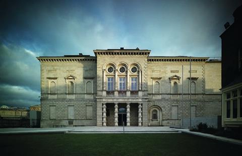
The whole complex forms an L-shape with one entrance at each end. The northern entrance is housed in the frontage of the Millennium wing and the eastern one frames the Dargan and Milltown wings behind it. This fine classical facade, complete with blind niches and heavy rustication, faces out onto the city’s Georgian Merrion Square and is one side of a semi-formal courtyard composition that includes Leinster House in the centre, which houses the Irish parliament, and the Natural History Museum on the other side.
All are protected historic structures, so the outside of the refurbished gallery looks little different to before – except in three barely discernible but crucial ways. First, the steps that once led up to the museum’s central porch have been removed and replaced by a newly landscaped forecourt that gently ramps up to the entrance. This is to accommodate a basement energy centre that has been built underneath the space, a feature which, as practice co-founder Róisín Heneghan explains, was critical to the new project.
“Previously the building had a Victorian heating system and no ventilation whatsoever. This new energy centre provides a CHP and also ensures that for the first time, the gallery and its priceless exhibits have modern environmental protection such as humidity control, fire suppression and appropriate air handling. A series of underground plant tunnels also enable the energy centre to supply all four wings as well as an anticipated fifth, which is part of a long-term masterplan vision.
“And crucially, it enables new plant to be concentrated in one place and kept away from gallery areas. This is particularly important as it keeps plant away from the roof, where installation would have been impossible due to the skylights that serve the upper floor galleries.”
The second way in which the museum’s retained external appearance is significant is in the entrance itself. Prior to the refurbishment, there was no internal public connection between the gallery’s two entrances and, as the success of the British Museum Great Court has shown, large public buildings can be tools for connectivity as well as culture. For Heneghan, the reorganisation of internal spaces to achieve connectivity was a crucial part of the concept.
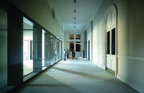
“We wanted to create a much more legible building and by enabling the public to flow through between the entrances it becomes a city route and part of the urban fabric.”
The third change is inspired by the building’s fragmented complexity and disjointed relationship with its neighbours. Due to the sloping ground there is a full floor’s height difference between the Merrion and Millennium entrances. Additionally as a result of various extensions and alterations over the years, the two-storey Dragan and Milltown wings must negotiate up to a staggering 14 level changes. But this all provides a legacy of dislocation that intrigued Heneghan and heavily informed the internal design.
“In many ways it’s a very Irish urban composition. Leinster House isn’t quite in the middle of the adjacent courtyard and the gallery isn’t quite on axis with the Natural History Museum opposite. So despite the presumed classical formality, there’s no symmetry and the multiple levels create a huge amount of choppiness and complexity. But these idiosyncrasies are also part of the building’s charm and presence and that’s what we wanted to capture in our intervention.”
And this charm is present in the only new addition to the building, the thin courtyard that separates the Dargan and Milltown wings.
A narrow refurbished lobby – now linked to the Millennium wing for the first time – separates the entrance from the courtyard, so it is encountered early in the journey through the museum and, by offering new stair and lift access to upper levels, helps rationalise the building’s disparate circulation.
Courtyard
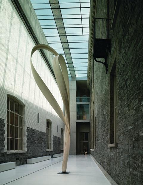
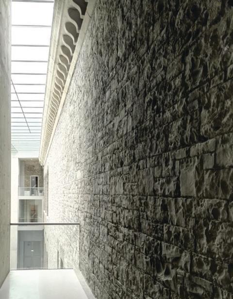
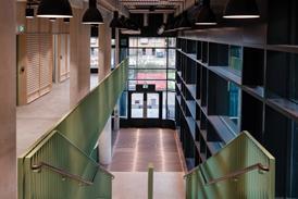
The new courtyard adds a glass roof to what was once a forgotten service yard, forming a light and lofty vault composed on clean lines and polished surfaces. Slinking between the two historic wings, it is bookended by the new concrete lift shafts and glass and steel stairs on either end. The heavy form and angular geometry of these elements are the only hints of the rugged scale serrated surfaces that are the architect’s signature style, most dramatically on display on its astonishing Giant’s Causeway visitor centre.
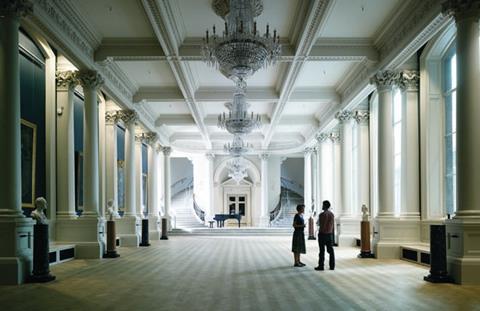
These elements are muted enough not to overwhelm the historic facades that flank them, yet convincing enough to imply the involvement of something new, a deft handling of the conservation/intervention tightrope. Moreover, with the patchwork expanses of granite, brickwork and ceramic glazing exposed and joined by concrete, steel, glass and a terrazzo floor, its diversity evokes the idiosyncrasy Heneghan sought to capture.
It also serves practical purposes. Like the forecourt, it is built over much of the plant of the energy centre, but unlike the forecourt, allows a boiler flue to be discreetly inserted through the lift shaft to the roof and thereby not interfere with historic gallery interiors.
And as gallery director Sean Rainbird explains, it helps the gallery achieve some of the broad essential offer that is now critical for major cultural venues. “First, it expands our entrance space – 19th-century galleries were all about the gallery rather than the foyer and ours previously was very small. And it also provides the kind of leftover space that is extremely important for 21st-century museums to have. This enables us to accommodate programmes like dance, theatre, performance and music; we can’t just be picture galleries anymore.”
Light
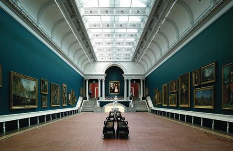
But it is of course the refurbishment of the historic picture galleries that forms the bulk of the project. This has been exquisitely done, so much so that, as Heneghan ruefully observes, it almost looks as if nothing at all has changed. But behind the scenes of course it has. All the galleries were completely stripped back to their brickwork shells, floors underpinned and then the new extract and air supply system carefully threaded behind walls and beneath floors before the reinstatement of period internal finishes such as alcoves, covings and architraves.
The chief architectural input of the interiors therefore becomes not one of fabric but of light. Prior to the project, the 1960s curatorial methodology of controlled artificial light held sway in the institution, and virtually all the windows and skylights had been blocked. Heneghan Peng has stripped these away with relish, washing formerly sullen interiors with extraordinary levels of daylight.
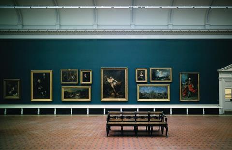
Incredibly, the large gallery windows that now face onto the new courtyard were once filled in with brickwork and plaster. In what may surprise some, Rainbird reveals that reinstating the windows was, at first, not universally welcomed. “Institutions like the National Gallery, the Louvre, the Prado and Smithsonian are accepted as the top tier in the art world. But we’re definitely in the second tier, with a permanent collection of around 3,000 pieces, roughly the same as the National Gallery in London.
“But we only have space to display around 650 of these at any one time. Therefore reopening a window means losing wall space. It’s a critical trade off. But the huge benefit in terms of visitor experience makes it worthwhile.”
In the upper galleries, new 2m-deep, maintenance accessible skylight boxes have been added that incorporate blinds and LED backlighting to modulate and diffuse light in line with changing requirements below. “Rather than the flat, artificial or imitation of north light the galleries used to have,” explains Heneghan, “it’s now possible to attain different light qualities that create a more flexible display environment.”
Overall, the revamp of the gallery reveals a subtle and restrained approach that has quite literally breathed life and light into a labyrinthine set of historic spaces. It is a conservation project that is not so much about new and old but more new behind old and it is this assured and largely invisible technical prowess that underpins the historic restoration on public display.
“For us, conservation doesn’t just mean either preserving or obliterating what’s already there,” argues Heneghan. “It has to be part of a continuum, you have to look at what’s there and base your decisions on that. If that means sometimes holding back so be it, it has to be based on judgment.”
The project also transcends a complex political backdrop. With Northern Irish unionists now seeking to stabilise the national government at Westminster and Brexit sparking debate about the border between the Northern Ireland and the republic, the redeveloped gallery and its wealth of unexpected treasures provides a rare opportunity to stamp Irish culture and not just Irish politics onto the British consciousness.
And as is often the case with culture, it makes surprising connections. The Dargan wing was designed by Francis Fowke, an eminent Victorian British engineer architect born in Belfast whose most famous work also happens to be the Royal Albert Hall in London. Equally, Heneghan Peng, headed by an Irishwoman and an American – Shih-Fu Peng – has designed the new school of architecture at Greenwich University.
Architecture, like politics, can be messy – and this project both smooths the complexity of the gallery’s past design interventions and adds its own distinctive contribution to that gloriously varied history. But unlike political affrays, architecture also tends to endure – especially when, like opening a long-blocked window, it throws light on the vibrant set of cultural treasures that bind the regions and nations of these British Isles together.
Project team
Architect Heneghan Peng
Client National Gallery of Ireland
Main contractor PJ Hegarty & Sons / John Paul Construction
Structural engineer Punch Consulting Engineers
Project manager Office of Public Works Project Management Services







No comments yet