Its grand height and formal aloofness may give it an air of superiority but on the inside the ŌĆśvertical villageŌĆÖ accommodates a wide mix of tenants and goes out of its way to make the people who work in it feel at home. Thomas Lane reports
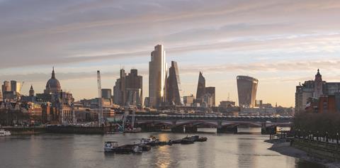
Any discussion of 22 Bishopsgate invariably moves quickly to its most obvious external feature: by City of London standards the building is massive. A wall of glass frames the view on the approach from Threadneedle Street or travelling north up Bishopsgate. From a distance, at 62 storeys the building towers above the Cheesegrater, Tower 42 and the Gherkin, which are mere booths by comparison.
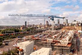
To be fair to architect PLP, it has tried to lessen the apparent bulk of the thing with two vertical steps running up the height of the building terminating in two horizontal steps at the top. The corners have been chamfered to soften it, too. The glass cliff effect will diminish because of later and adjacent developments; next door 8 Bishopsgate, which is under construction, is so close that the two buildings almost touch. In time, the top of 22 Bishopsgate will resemble the centrepiece of an overdressed dining-room table.
Essentially, 22 Bishopsgate is a reaction to a building cancelled in 2012 when the money for construction dried up after the financial crash. The ill-fated Pinnacle was too expensive for the post-financial crash world and the site sat abandoned until 2015, when fund manager Axa bought the site and appointed Lipton Rogers as developer.
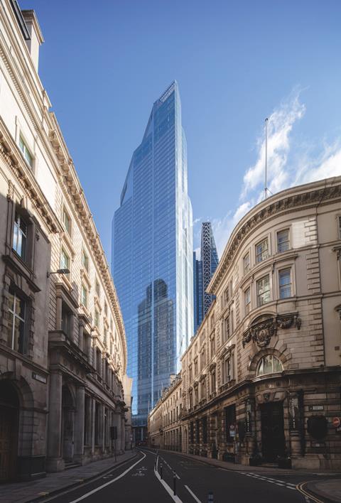
With PLP, Lipton Rogers reinvented the site for a more austere era by pushing the building to the site boundaries and increasing the amount of lettable space by 30%. The building reached practical completion in December 2020 in a world that had changed dramatically yet again. The pandemic had a profound effect on the way people worked, with many spending a much greater proportion of their time at a home desk.
This begs the question, did London really need another 118,500m2 of office space at a time when people were rowing back from office working? Nearly two years after it was finished, ║┌Č┤╔ńŪ° toured the building with Lipton Rogers founder Peter Rogers to find out.
A wellness building
Despite being conceived well before the pandemic, making the office attractive to workers was still a priority for Lipton Rogers. ŌĆ£The whole idea of the building was about wellness and was something we locked into early on to try and encourage people to come to the office,ŌĆØ explains Rogers. ŌĆ£Do you enjoy coming to the office, or is it a drudge and you are looking forward to your retirement because that is what you are working for? Or is it fun to come to the office? We are trying to make the office compete with the home, so a lot of the facilities here are supporting that.ŌĆØ
Wellness is a key part of this. Early on, Lipton Rogers decided to integrate WELL building standard features ŌĆō which include plenty of natural light, good ventilation and facilities such as a gym and access to healthy food ŌĆō into the shell and core so that tenants could achieve WELL certification, although this depends on their specific fit-out.
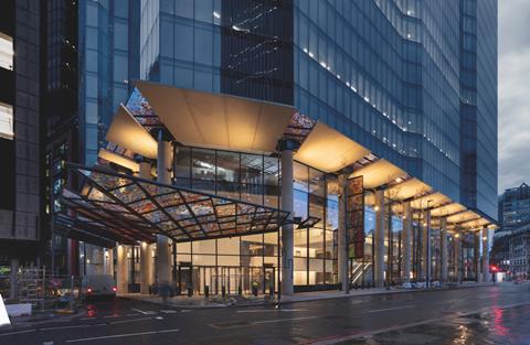
Up close, the first impression of 22 Bishopsgate is that this is indeed a building with a difference. A row of round, external structural columns give an imposing, formal first impression but this is brightened up with multicoloured glass canopies over the street.
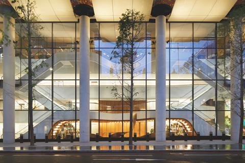
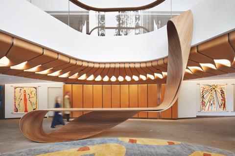
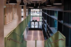
Once inside, the double-height lobby features two mezzanines with plain white walls enlivened by colourful artworks from a variety of artists, and a sprinkling of curvaceous wooden furniture rather than sofas. There are no reception desks; rather like the so-called geniuses in Apple stores, there are reception-come-security staff floating around to guide visitors.
Facial recognition at the entrance to lift lobbies will negate the need for a physical pass once these are up and running. ŌĆ£The idea is ŌĆō if you are known and itŌĆÖs your building ŌĆō you walk straight in, up to your lift and go up to your floor uninterrupted. Nice, easy, and very human,ŌĆØ Rogers says. The approach is in direct contrast with 100 Bishopsgate just up the road. Completed a year earlier than 22 Bishopsgate, it features a huge, white marble-clad reception area with a long bank of reception desks. Although elegant and imposing, this is exactly the type of traditional reception Rogers wanted to avoid.
Workers are transported to their floors in high-speed, double-deck lifts adorned with artwork by artist Bruce McClean. Some of the lifts extend right to the top of the building, alleviating the need for sky lobbies.
Once outside the lifts, workers will be very much in their employerŌĆÖs domain. The lift lobbies feature plain white walls with timber reveals around the lifts, the idea being that tenants can put their own stamp on these areas.
Stepping out onto the office floors reveals the two key attractions of 22 Bishopsgate. The floorplates are huge, measuring 87.5m x 38.8m below level 48. And the view is breathtaking. Second only in height to the Shard, the buildingŌĆÖs upper floors offer a birdŌĆÖs-eye view of the City, including down onto Tower 42 and the Gherkin and well beyond. The low-iron glass used for the glazing is very clear compared with ordinary glass, further enhancing views.
How many people are still coming into work?
When ║┌Č┤╔ńŪ° visited on a Tuesday morning, there were 3,500 people in the building ŌĆō a little over a quarter of its 12,000 capacity. About 10% of them had cycled in, which suggests that if the building was fully occupied then most of the 1,700 cycle spaces in the basement would be needed. The reality is that the building is unlikely to ever have 12,000 people in on any one day because of holidays, hybrid working and absenteeism. Rogers reckons a more realistic maximum occupancy is around 5,000 people.
The tenants are mostly banks, law firms and tech companies, with the majority taking between two and four floors. The large floorplates are a draw because firms can fit everyone in over two to four floors rather than perhaps 10 floors of a smaller building. Internal stairs mean employees can easily move around their space rather than relying on lifts.
Fewer occupiers on any given day means less pressure on building facilities, including the stairs and lifts. Lift usage peaks used to be 8am to 9am, 12pm to 2pm, and 5pm to 6pm, says Rogers, but ŌĆØthat has mostly goneŌĆØ because people are coming in and leaving over wider time windows at the start and end of the day. ŌĆ£During the midday one ŌĆō between 12pm and 2pm ŌĆō there are still quite a lot of people moving up and down the building,ŌĆØ he adds.
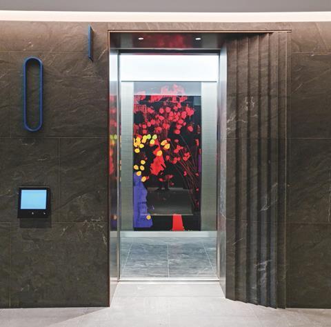
Given the building has 24 double-deck lifts ŌĆō the equivalent of 48 conventional lifts ŌĆō which take up a lot of space and are expensive, could the next Lipton Rogers building include fewer of them? Rogers thinks not because it is impossible to predict how usage patterns will change over the lifetime of a building.
ŌĆ£The problem with stairs and lifts is you canŌĆÖt modify the building afterwards. You can tweak some things afterwards but not putting in another lift or stairs,ŌĆØ he explains. And the density of people across the building will vary. It has been designed to accommodate one person per eight square metres (1:8) with the stairs designed to accommodate a density of 1:6. ŌĆ£You donŌĆÖt want to be caught short if one end of the building is densely occupied.ŌĆØ
He adds that occupancy rates are a hot topic of discussion at the British Council for Offices (BCO) because of the changes in the way people work. The BCOŌĆÖs guide to specification assumes an occupancy level of 80% capacity, but a position paper published this summer suggests this could be reduced to 60%.
Rogers says: ŌĆ£We havenŌĆÖt [reduced this] yet because we want to see how this all settles down.ŌĆØ The paper also suggests increasing the space allowed for each worker from 1:8 to 1:10. Rogers reckons that the occupancy density at 22 Bishopsgate is currently between 1:10 and 1:12, which reflects those proposed BCO changes.
Smart technology helps to tune the buildingŌĆÖs systems to suit the number of occupants. The combination of artificial intelligence and sensor technology ensures air-conditioning is only on in occupied areas. ŌĆØThere has been something like a ┬Ż400,000 saving in the first year just by working out how the building is used,ŌĆØ Rogers says. ŌĆ£And year on year you will get improvements.ŌĆØ
The floors are fitted out to Category A standard, an agent requirement at the time of the buildingŌĆÖs conception. ŌĆ£The floors are boring, really simple so the tenants can modify them as they want,ŌĆØ explains Rogers, adding that he hopes this does not extend to wastefully ripping out the ceilings which are an innocuous plain white.
Nearly every tenant with multiple floors has punched through the composite metal deck floors to add internal stairs. ŌĆ£It is very simple metal deck and steel frame,ŌĆØ Rogers says. ŌĆ£ItŌĆÖs easy: get a tin-opener and open up a hole where you want. The whole idea was to make it flexible so tenants can do what they want.ŌĆØ
The views are not just restricted to the bankers, lawyers and insurance brokers in the building. Level 58 is a dedicated viewing gallery which will be open to the public and ŌĆō unlike the ShardŌĆÖs ┬Ż25 entrance fee ŌĆō is free. There will also be three floors of space for restaurants and bars above the viewing galley which will be open to the public, too. This area is served by a dedicated entrance and lift to avoid queues of people clogging up the tenant lobby on the ground floor.
The phrase ŌĆ£vertical villageŌĆØ repeatedly pops up as a description of the range of facilities inside the building. Given the building is designed to accommodate 12,000 people, ŌĆ£vertical townŌĆØ might have been a more accurate description.
For starters there is space in the basement for 1,700 bicycles, a space so vast that different areas are colour-coded so people can find their bike more easily when leaving. There are lockers, showers and changing rooms on this level, and tenants get clean towels. There are Brompton folding bikes for hire too.
Called the Market, level two is dedicated to food and drink and features a restaurant, a bar with an outdoor terrace, more informal pop-up type eateries and a catered events space. The 25th floor includes a gym with a climbing wall, and there is an area called the Retreat on the 41st floor. Very much part of the wellness narrative, there will be yoga classes and mental health therapies on offer here once this area is up and running.
Co-working spaces
Recognising that small businesses do not want to take long leases on big floors, the so-called Exchange on level seven is 22 BishopsgateŌĆÖs equivalent of co-working provider WeWork. Offering a variety of spaces, people can sign up to a range of packages and can rent a single desk or desks, a large meeting-room type desk in the middle of the space, or more private meeting rooms. There are even radio podcast facilities and soundproof recording studios.
The space was originally going to be a plant room, but efficient plant packaging liberated it for other uses. A double-height space, this includes an auditorium.
A more radical departure from the co-working norm is an area called Convene on levels three and four. Run by an external company of that name, it is the events equivalent of co-working as the floor features several large meeting-room and conference-type spaces. The biggest holds more than 400 people, and a further four spaces hold in the region of 200.
Project Team
Developers AXA IM ŌĆō Real Assets and Lipton Rogers Developments
Engineer WSP
Architect PLP Architecture
Contractor Multiplex
Cost consultant Alinea
EmployerŌĆÖs agent Aecom
Full catering services are provided, there is a barista, and there are more informal work areas where groups of people can meet around desks. Like Exchange, Convene is membership based.
For Rogers, Convene is an example of how office space has evolved in recent years, with the building designed to easily adapt to those changes. ŌĆ£The building is as loose-fit as possible,ŌĆØ he says. ŌĆ£As tenants come in and you start to understand what they would like, you can make the building reflect those needs. One thing we donŌĆÖt want to do is pre-impose a whole pile of things and find no one uses them.ŌĆØ
Levels three to seven, where Convene and Exchange are located, are served by a dedicated bank of lifts. Rogers says Lipton Rogers originally assumed this 200,000ft2 space would appeal to a company that wanted an HQ type of office with independent access. Rogers says talks with Convene are ongoing to take the two remaining floors in this part of the building.
Rogers adds that, although Convene and Exchange are available to people who do not have space in the building, it enhances the appeal of the building for occupiers.
ŌĆ£Historically, what firms tended to do is to take a floor, and let half a floor off for expansion and have half for themselves. Now what they are tending to do is use these sorts of spaces, so you donŌĆÖt necessarily need meeting rooms because youŌĆÖve got them here,ŌĆØ he says. ŌĆ£For some situations you donŌĆÖt even need to rent office space because you can rent it here.ŌĆØ
In answer to the original question ŌĆō did London need another huge office building? ŌĆō the answer seems to be yes, as the building is now 90% let. Given the building was just 66% let in November 2021 ŌĆō when for many working from home was the norm ŌĆō the Lipton Rogers approach has been vindicated.
What would the developers do differently next time?
Lipton Rogers is currently working with real estate investor Hines on the redevelopment of 18 Blackfriars Road in Southwark, south London. Designed by Foster + Partners and currently out to public consultation, the scheme proposes three brick-clad towers: a 210m-high office building, a 160m-high residential tower and a 100m tower containing affordable housing. The buildings will be clustered around a central plaza.
For Rogers the key difference between this scheme and 22 Bishopsgate is the carbon impacts. According to structural engineer WSP, the latterŌĆÖs embodied carbon is impressively low at 591kg CO2e/m┬▓ which is actually 2% lower than the LETI best practice 2020 embodied carbon target for non-domestic buildings of 600kg CO2/m2.
The reason the embodied carbon impact of 22 Bishopsgate is so low is that it reused the foundations of the ill-fated Pinnacle as well as those of buildings previously on the site from the 1980s and 1960s. The building did need some small-diameter piles around the site perimeter as 22 Bishopsgate was bigger than the previous buildings on the site. And 50% of the existing three-storey basement was reused too.
At 18 Blackfriars, Rogers says the aim is to reduce embodied carbon to 475kg CO2/m2. The building will feature concrete-encased steel columns, which will reduce the cross-section and therefore material use. Carbon will also be saved by avoiding finishes such as suspended ceilings and by leaving concrete exposed in lift lobbies rather than covering it over. The building will also include charging facilities for electric bikes and higher fresh air supply rates in the offices.
Rogers says whole-life carbon calculations should be treated with caution, because materials will change in the future. ŌĆ£ItŌĆÖs very difficult to predict 20 years ahead, when you come to refit the building. By then steel may be zero carbon because we have got so much low carbon energy or other materials may have been developed,ŌĆØ he says.
And putting in technologies now to save carbon later should be avoided. For example, 10 years ago there was a trend for fitting biomass boilers in offices to hit carbon targets, but many of these were never switched on. And more recently, gas-fired CHP, a technology used at 22 Bishopsgate, has been superseded by heat pumps. On the other hand, he says: ŌĆ£Leaving materials out will never be a problem as this always saves carbon.ŌĆØ
For Rogers the secret of building long life is to keep it simple. ŌĆ£║┌Č┤╔ńŪ°s need to be relatively simple structures so we can change them around; you can convert a building to residential or residential to office; you need that flexibility.ŌĆØ
This excludes modular construction as the fixed size of modules restricts changes in the future. And prefabrication should be treated with caution too. ŌĆ£We put prefabricated toilets into Broadgate in the 1980s and they were a disaster in the long term,ŌĆØ Rogers says.
ŌĆ£They were brilliant on day one as these beautiful toilets were wheeled in, but how do you refurbish them? They are built in a factory, so you have to rip them apart from the inside; there is the sub-frame to deal with, so do I rip that out as well?ŌĆØ
Speaking of Broadgate, Rogers looks out of the window towards the multiple award-
winning office scheme he developed while at Stanhope with Lipton in the 1980s. This is being redeveloped over 10 years by British Land. ŌĆ£I think environmentally it [the redevelopment] is a nightmare as those were good buildings,ŌĆØ Rogers says. ŌĆ£We are going to have to start talking about how we reuse buildings. We can do much more, and planners need to be much more cautious about allowing demolition.ŌĆØ
He concedes that some buildings will need to be demolished because the floor-to-floor heights or column grids are inadequate for modern use and it is better to knock these down and build a better one now rather than limping on with the existing building and demolishing it in 20 yearsŌĆÖ time.
But get the structure right and the building can be easily refitted many times with expensive, carbon intensive elements such as cladding systems refurbished and fitted with new glass rather than being thrown away ŌĆō a job which could become much cheaper if this moved from being the exception to the norm. As Rogers says, ŌĆ£We canŌĆÖt keep burning through materials the way we do.ŌĆØ








No comments yet