Heatherwick Studio’s Coal Drops Yard retail hub in north London revels in the idiosyncrasies of its original Victorian warehouse architecture and uses them in a brazenly theatrical way to upstage all else on Argent’s King’s Cross Central masterplan.
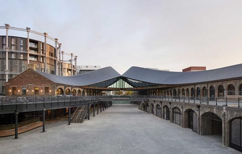
With the possible exception of Frank Gehry, there aren’t many names in architecture who would be brave or populist enough to make an analogy between their building and a cartoon, but Thomas Heatherwick is one of them. When describing his new Coal Drops Yard at its opening last week, Heatherwick described it thus: “It’s like that moment in a cartoon when the two characters slam into each other and all the sparks fly and the energy reverberates around them in shooting, shuddering stars.” The two characters in question here are the two almost-parallel longitudinal Victorian warehouse blocks that form the Coal Drops Yard retail development in London’s King’s Cross. And the moment of impact is captured in three-dimensional form by the extraordinary roof that joins them like a suspended pool of lava pouring down from an invisible upturned crater above.
Coal Drops Yard is arguably Heatherwick’s most visceral and provocative work to date. Setting aside the controversy of the ill-fated Garden Bridge (whose malignancy was barely design-related in any case), Heatherwick is famed for crafting highly expressive, sculpturally porous objects that often challenge perceived conventions but do so in a manner that combines rational legibility with almost theatrical flamboyance. He has replicated his signature formula once again at Coal Drops Yard, where his cartoon analogy perfectly captures the zany spirit of energy, movement and idiosyncrasy in which his latest scheme revels.
Two fingers
Coal Drops Yard began life in 1851 as a warehouse that received coal transported to London by rail from northern England. Of the two warehouse wings, which Heatherwick also euphemistically refers to as “KitKat fingers”, the eastern one came first, with the western twin following nine years later in 1860. The warehouses were built beside each other but slightly askew: the gap at the northern end measures 26m but widens to 39m at the southern end. This asymmetry was to become an important conceptual driver in Heatherwick’s design.
As with most Victorian infrastructure, particularly that concentrated in King’s Cross, the warehouses were a work of engineering ingenuity. The buildings were two storeys high, with the lower storey essentially a basement scooped into a sunken yard. Trains would come in on the viaducts alongside each buiding and their coal would be “dropped” through retractable wagon bases directly into hopper cars below. The coal would be bagged up and collected by horse and cart for distribution throughout London.
In its heyday, Coal Drops Yard handled about 8 million tonnes of coal per year, effectively powering Victorian London. But its heyday was relatively short-lived: by the 1880s, newer energy sources reduced the city’s reliance on coal and consigned Coal Drops Yard to a century of typical London backstreet storage and light industrial uses. This included a sporadically nefarious mix of car garages, criminality and nightclubs – the latter spawning the infamous Bagley’s of 1980s and 1990s fame.
By the 2000s the site had been subsumed within Argent’s ambitious King’s Cross Central masterplan and had been identified as the development’s retail hub. Heatherwick was eventually appointed and, armed with his experience on the Pacific Place shopping centre in Hong Kong, immediately sought to create a new kind of retail destination.
“So many new shopping centres are sterile environments that kill user experience. Additionally, they are normally enclosed spaces with limited entrances. We wanted to do something very porous and with lots of entrances that prioritised social interaction and experience. In the digital age, that’s more important than ever,” he says.
Social chemistry
But while Argent took the wise decision to retain the Coal Drops Yard buildings, Heatherwick immediately spotted challenges in their conversion. “Shopping centres rely on social chemistry – the distance between shopfronts is normally only around 10m to 12m, which is a comfortable social distance for people to navigate. The problem here was that the gaps between the two blocks, 26m to 39m, were simply too big to generate that kind of intimacy.”
So the decision was taken to add some sort of link structure between the two wings. This, according to Heatherwick, would generate the “centrality and heart” that would be essential in “gluing the scheme together”. But as he goes on to explain, this too presented its own set of problems. “There’s a strong linearity to the blocks; they’re almost like skis. But the rectangular bridges initially planned would have fought with this directionality and imposed something alien.”
So rather than bridging the gap between the wings with some kind of rectangular link box, the design team set its sights higher, both figuratively and literally. A fire in the 1980s had destroyed a large section of the slate pitched roof on the eastern block, which was to be replaced as part of the redevelopment. It then occurred to the team that rather than rebuilding a section of the roof, they could rebuild the entire roof and use it, in Heatherwick’s words, to unify the whole scheme.
“Instead of sticking in a new form, we stitched the scheme together by allowing the two roof ‘fingers’ to grow towards each other,” he explains. “Not only does this create a new covered central space that forms the heart of the scheme, but it also develops a new language for the entire site.”
The result of this “growth” is indeed the enigmatic and virtuoso centrepiece of the scheme. At the four gable ends of the two blocks the roofs begin in conventional form, their glistening new Welsh slates procured from exactly the same quarry as the original roof slates were 150 years ago – and therefore virtually indistinguishable replicas. While the slate has been universally replaced, original roof trusses have been retained where possible.
Rising and bulging
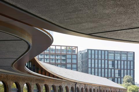
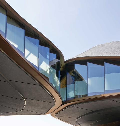
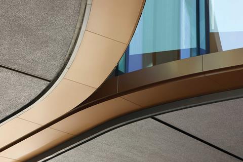
But as the roofs progress along the building, they begin to rise and bulge outwards, as if helplessly deformed by the ripple of a gathering wave underneath. As they tear away from the brickwork below, the rising gap is filled by vertical glass panels laid in a sawtooth pattern, their staggered footprint a cheaper alternative to curved glazing but also a gentle and fitting reminder of the angular geometry of their warehouse hosts.
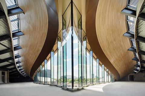
Eventually, the curved roofs on either side join in the middle, curled upwards like a skirt raised to reveal a suspended glass attic flashing saucily below. The attic is in fact held up by some extraordinary structural gymnastics largely hidden from the eye. Two large sloping steel frames rise up from either warehouse, forming a triangular ladder tucked underneath each hood of the upturned roofs.
A hundred and four slender black columns then descend from this ladder and support the attic floor below, intricately threading their way through the historic structure within the warehouse and down to new foundations that bear their full load. Internally the result is a voluptuous attic chamber, a charged, contortionist knot trimmed with timber and glass, pulsating with all the illusory spatial distortion of a fairground hall of mirrors rammed into the upturned hull of a boat. Incredibly, no function has yet been devised for this space, but it is not difficult to envisage its dynamic form inspiring all manner of curatorial experimentation.

Externally too, the twin curving roof gesture offers a curious, improbable yet utterly thrilling visual spectacle quite unlike what one would expect from a scheme that elsewhere takes great pains to exhibit such heritage sensitivity. That sensitivity is evident from the new glass fronts carefully placed within cleaned brick arches to form retail units to the six new cores subtly inserted into selected bays.
It is also evident in the new ground-floor shopping street that runs through the scheme linked to a broad upper terrace by a series of stairs. “We took a hotchpotch of levels and rationalised them to aid the flow and movement of people,” explains Heatherwick, “but we didn’t rationalise them too much; it was all about using as much of the existing fabric of the building as possible to solve problems and meet challenges.”
As it happens, despite being built for an entirely different purpose, much of that fabric proved surprisingly adaptable for retail. Retail units range from just 15m² to the four 2,000m² anchor units at each end of the warehouse. But the size of many of the units in between was determined by the various sizes of arches cut into the original brickwork facades. “Victorian industrial architecture is incredibly flexible and reusable,” says Heatherwick. “In many ways they were the Ikeas of their day. They offer a huge amount of variety and idiosyncrasy.”
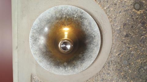
And that idiosyncrasy forms the final crucial element of the new and old Coal Drops Yard. There are sustained patterns of asymmetry, illogicality and sheer oddness in the original buildings, ranging from the multiplicity of arch sizes and openings to the fact that the eastern block is significantly longer than its twin. But idiosyncrasy is an area Heatherwick traditionally revels in and he grasps it here with unbridled enthusiasm to stimulate conceptual affinity with the building’s past. For instance, lift call buttons are encased in a variety of decoratively ergonomic necklaces that range from bulging brass bowls to peeling concrete straws.
Catalogue of curios
But of course, chief among this catalogue of curios is the thrusting twin attic itself. Despite its improbable and perhaps even implausible gait, it forms a brilliantly inventive and irrepressibly theatrical way to insert a contemporary component into a heritage building through manipulation of the very heritage assets – in this case its roof and its idiosyncrasy – that form that building’s core identity. And in doing so it provides the kind of operatic spectacle that enlivens the conventional shopping experience.
“This country is blessed with such an incredible wealth of heritage”, argues Heatherwick, “that we can’t use the same formula for all of them. We have to find new ways to respect, care for and love them.”
And find it he has. Do not be misled by those who will inevitably decry Coal Drops Yard as a conceited and inauthentic gimmick that mauls a historic building for crass consumerist gain. For in its soulful human empathy, in its irrepressible reinterpretation of the building’s innate oddities and most of all in its scintillating, edge-of-your-seat rooftop cliffhanger, Heatherwick has once again proved himself to be a master architectural storyteller in the colourfully eccentric manner of a Baz Luhrmann or Roald Dahl.
Project Team
Architect: Heatherwick Studio
Client: Argent
Main contractor: Bam
Structural engineer: Arup
Services engineer: Hoare Lea
Cost consultant: Gardiner & Theobald







1 Readers' comment