Or, how three developers, one city council and a handful of architects transformed a reviled 1960s concrete lump into the apotheosis of cool design. Martin Spring tells the story.
When shopping centres first arrived on the scene in the 1960s, they created a peculiarly oppressive synthetic universe. They were windowless megastructures whose interiors were artificially lit, heated and ventilated, impregnated with soulless piped music, and tricked out in cheap and glitzy decors based on glass-fibre, nylon, plasterboard and mirrors. They were giant temples to the retail gods, through which worshippers would follow a ceremonial route from gloomy basement car park through dingy mall to the altars housed in the rows of glittering shops opening off them.
Nowhere was the shopping centre more divorced from the natural world than in Birmingham. The city council celebrated being at the heart of Britain’s car industry by girding the city centre in an elevated ring road, and in the space left over the Bullring shopping centre was developed and opened in 1964. The ground sloped steeply down by 19 m across the site from the city centre to Digbeth, and the public was forced to scuttle up and down mean, dank dog-leg staircases and underpasses to reach the shops. The huge neogothic St Martin’s Church, standing at the foot of the slope, and the historic open market spread out next to it, found themselves overshadowed by the concrete flyovers and boxy structures that erupted alongside them.
In other words, the Birmingham Bullring broke every clause in the architectural rulebook. It was not long, however, before architectural justice prevailed. By 1970, the centre started to decline as shoppers shunned its hostile environment, and by the 1980s plans were being drafted to redevelop it as a more human environment.
Now, 40 years on, the Bullring has been comprehensively and radically redeveloped. It’s still a vast temple to retail – indeed, at 110,000 m2, it is three times the size of the 1960s complex it replaces and weighs in as the largest shopping centre redevelopment in Europe this decade. In form it remains essentially a megastructure atop a double-decker undercroft of car parking.
That said, there has been a concerted effort to domesticate this rogue building type and rehabilitate it into the real world of architecture. The basic architectural elements of natural daylight, human scale, fresh air and integration with the surrounding city grain have all been rediscovered, and for a giant shopping centre this is a remarkable achievement in itself. In addition, the steep slope across the site, which had been such a nuisance to the original highway engineers and retail designers, has at last been exploited as an exciting architectural boon.
So notorious were the many architectural and access failings of the old Bullring that they spread beyond the shopping centre and cast a baleful shadow over the image of the whole city centre. And the city’s image has been burnished with the creation of a E E sensationally futuristic icon as the centre’s anchor store. As designed by Future Systems, Selfridges now rises like a silvery half-molten iceberg behind St Martin’s church. Little wonder this image is already being splashed in large advertisements across the New Street Station concourse.
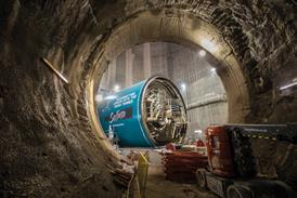
The transformation of the Bullring was not just the work of the three developers, Hammersons, Land Securities and Henderson Global Investors, and their consultant architect Benoy. Just as the prime mover in the original scheme, with its concrete flyover, was the city council, so the council came to accept that, to liberate the site, it would have to destroy the monster it had created. After a conference of urban regeneration experts pointed out in 1988 that the city centre was being strangled by the “concrete collar” of the elevated inner ring road, the council went about demolishing it in phases, reducing it to a conventional ground-level road. At the Bullring, this ground-level road now skirts the lower end of the site beyond the church, though there is still a vestige of the old 3D highway maze in the shape of a new single-carriageway tunnel for buses, taxis and the future Metro tram that now burrows through the upper end of the site.
According to Benoy’s project director, Nick Guy, the design watchword was “permeability” – the principle that the new shopping centre should be opened up to the surrounding streets with unimpeded pedestrian routes and views crossing the site. “It’s about creating streets and squares that connect back into the city,” he says.
By removing the elevated roadway, underpasses and access stairs and submerging two levels of carparking below ground, the shops could effectively be built at ground level. Punters could then walk to and from surrounding streets without having to negotiate any steps, traffic-dominated roads or other barriers.
The primary axis through the site runs radially in and out of the city centre from the base of the drum-shaped Rotunda tower down to St Martin’s Church and Digbeth High Street beyond. This line also happens to offer the most inspiring vista, which is of St Martin’s at the foot of the hill. And the view in the opposite direction up to the landmark Rotunda tower at the brow of the hill is scarcely less memorable. Accordingly, Benoy has split its megastructure down the middle with a ground-level pedestrian street that funnels outwards as it sweeps downhill and embraces the church at the bottom in two outstretched wings. The two roughly triangular blocks on either side of the central walkway are themselves bisected by V-shaped shopping malls.
However, this simple layout was complicated by the bus tunnel, that crossed beneath the main axis near the foot of the Rotunda. The tunnel had the effect of raising the pavement level at this point and steepening the slope beyond it down to St Martin’s. In fact, the slope was now deemed too steep for disabled access, so Benoy cut short the axial pedestrian route about two-thirds of the way down the hill and swept it round in a gently sloping crescent to the right.
Fortunately, making the route more complicated in the interests of disabled access had added drama to the route. As you approach the new complex from the base of the Rotunda, you are presented with three streets splaying off in different directions. Take the central and widest walkway, and as you walk up and over the slight hump over the bus tunnel, the stone spire of St Martin’s suddenly hoves into view, neatly framed by the buildings on either side. Then on reaching the wide terrace and glass balustrade where the pedestrian route sweeps round to the right, the entire church opens up before you in a wide bowl-shaped piazza of its own. The intention is that cafes, bars and street vendors will spill over into these generously proportioned streets and piazzas.
The steep slope across the site has also been craftily exploited to create three storeys of shopping malls stepping down the hill, each with its own entrance at pavement level. This configuration allows the lowest storey of the two malls to link up below the central walkway, giving the public a sheltered all-weather route through the whole complex.
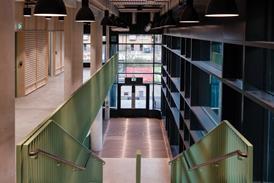
Even the internal shopping malls manage to continue the theme of permeability and conventional shopping streets. “They respond to lots of existing alleyways that thread their way through the city,” explains Guy. Following on from the Bluewater shopping centre in north Kent, for which Benoy was executive architect, the malls are as wide as many city streets. But unlike Bluewater, they are roofed over by flat planes of frameless, nearly clear, glazing that oversail the shops on either side and are supported from above by delicate steel trusses. “We call the glass roofs ’skyplanes’,” says Guy. “What we intended was no roof at all above an open street, or as little structure as possible.”
The shops along the malls are designed to resemble external buildings, using brickwork, glass windows and Jesmondite, a rough-textured fibrous plaster that could be mistaken for natural stone. The facades on opposite sides of the malls have been designed in differing materials and window patterns, further breaking down the impression of an oppressively unified internal mall. Similarly, the entrance facades to the malls take the form of flat vertical planes of nearly clear frameless glazing.
This care over the external streetscape led to the appointment of a bright young landscape architect, Gross Max, to design the paving, tree planting and street furniture. What’s more, the streets and malls have been adorned with a rich collection of large-scale public art costing £2m. As well as a glass water sculpture of changing colours by Gross Max, this includes a cluster of three lofty, carbon-fibre masts by Peter Fink that glow with internal lights in orange, pink and green and sprout rotating “leaves” of stainless steel. As part of the planning gain, St Martin’s Church and the abandoned Moor Street railway station nearby have been restored, and the latter reinstated as a mainline train station.
In comparison with the rest of the complex, the 23,225 m2 Selfridges department store is, if anything, a throwback to the arrogant old days of black-box retail megastructures. Except on the ground floor and around the first-floor entrance, windows were banished by the client from the six-storey building, as these would squander precious wall space for displaying merchandise.
As a result, the monolithic building presents an inscrutable cliff face to the adjacent street. However, architect Future Systems has done its best to compensate with the jaw-droppingly bizarre whale-like form clothed in a gown of shimmering aluminium discs. So what it loses as an unsociable neighbour, the Selfridges store more than gains as a spectacular icon, which is at its most compelling as a silvery backdrop to the spiky sandstone steeple of St Martin’s.
The developers and the city council are hoping that the shopping centre will transplant a vigorous retail heart into Britain’s second city. On the other hand, the 117 shops, cafes and bars that make it up are mostly the standard high street chain-stores, which will put some people off. And the provision of 3100 car-parking spaces, instead of boosting more sustainable access by public transport, has provoked howls of protest.
As regards design, Benoy’s scheme is a few cuts above the sub-classical toytown of Chapman Taylor’s suggested redevelopment in 1990. Yet it is still has an air of contrivance, with the street and mall facades of the two large building blocks arbitrarily broken up into an assortment of materials and window patterns, falsely suggesting rows of small, individual buildings. And the four large tubular-steel trusses that span the bus tunnel are unconvincing as expressed heavy engineering structures. There are no visible connections to the buildings they are supposed to support, and one of them seems to give up in mid-span between two buildings.
Despite these cavils, the Bullring marks an important step in turning the shopping centre into a respectable piece of Urban Design and architecture. The next step will be to develop genuinely independent buildings, each designed by different architects, and introduce homes and workplaces. For this we will have to wait until shopping centres now on the drawing boards for Liverpool and Sheffield are completed.
Downloads
Ground-floor plan
Other, Size 0 kb
Credits
Developers Hammerson, Land Securities Group, Henderson Global Investors Concept architect Benoy Highways and structural engineer Arup Civil and structural engineer The Waterman Partnership Services engineer WSP Group Landscape architect Gross Max Planning consultant Montagu Evans Quantity surveyor Gardiner & Theobald Detailed design architect Chapman Taylor Architect for Moor Street Station imons Design Design and management contractor Sir Robert MacAlpine


No comments yet