The world’s skinniest skyscraper gloriously embraces the rich legacy of Manhattan’s historic skyline, but it also raises awkward questions around sustainability and affordable housing, writes Ben Flatman

Designing a tall building is a big responsibility in any context. But getting the chance to design a brand-new skyscraper in New York must be one of the biggest challenges any architect can face.
Our familiarity with the Chrysler, the Empire State, and the city’s soaring peaks and echoing canyons has made the Manhattan skyline more than iconic. People around the world who have never even visited have an attachment to it that is akin to a sense of ownership. It is, as much as a huge chunk of towering real estate ever can be, public property.
So, what do you do when a developer comes knocking and you’re asked to make your own addition to the world’s most recognisable cityscape? This was the challenge that faced Dana Getman when developer Michael Stern approached SHoP Architects in 2013, with a commission for a super thin Midtown skyscraper.
Stern’s first question to Getman and her colleagues at SHoP was, “what’s your favourite New York building?”
“It was beyond what you could plan for in architecture school” she tells me. “When they asked me if I was interested, it was ‘Of course I am!’”.
I meet Getman in the lobby of her recently completed building at 111 West 57th Street. She is low-key and gives off an air of focused professionalism. It is clear from speaking to her that, while she has relished the opportunity presented by the project, she has also approached it with seriousness and a meticulous attention to context and detail.
Before even telling them where the site was, Stern’s first question to Getman and her colleagues at SHoP was, “what’s your favourite New York building?” She cited Grand Central Station and the incredible body of work of Ralph Thomas Walker, once named “architect of the century” by the New York Times, whose highly stylised art-deco buildings have been so influential in architecture and film.
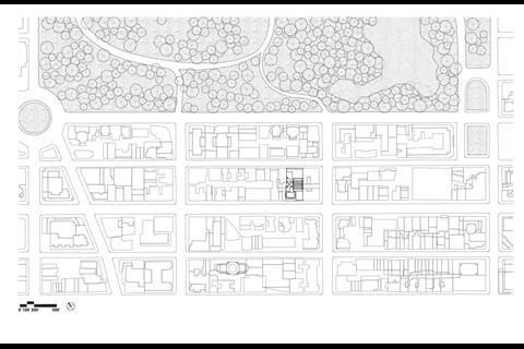
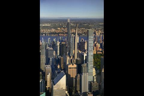
The plot is two blocks south of 59th Street and sits just east of Central Park’s central axis. It is hard to conceive of a more prominent location for a high rise in the whole of Manhattan. Not only this, but the site was also already home to the protected 1925 Steinway Hall, by Warren and Wetmore, the architects of Grand Central.
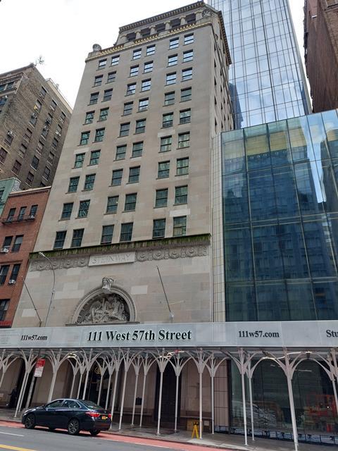
It was clear to Getman from the start that this was going to be far from a conventional high-rise project. “We all recognised the importance of this place in the heart of our favourite city. We had to think about the legacy and the next generation skyscraper for New York”, she tells me. “We wanted this building to be of the place. New York, not Dubai. You know where you are. Everything from detail to massing is telling a story”.
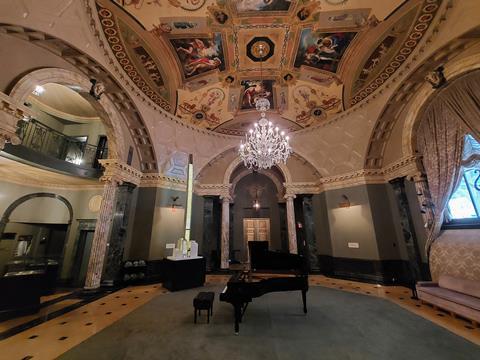
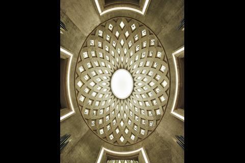
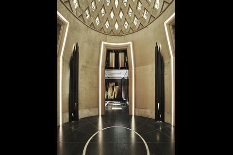
Steinway & Sons commissioned Steinway Hall for their own use in the 1920s and continued to occupy part of it until 2014. The building has been visited by practically every piano virtuoso to have played in New York over the preceding century, including Rachmaninov. The basement contained workshops and the ground floor still contains what was the main showroom, a double height space with an ornate Beaux-Arts rotunda.
“We had a historic building, so one of our first challenges was how to protect the legacy,” Getman tells me. Because of the location, and protected status of the building, SHoP were required to work closely with the New York City Landmarks Preservation Commission (LPC).
The LPC was set up following the 1963 destruction of McKimm, Mead and White’s Penn Station and is responsible for protecting the city’s architectural and cultural heritage.
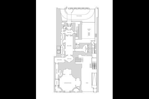
Steinway Hall was primarily built as commercial space, but with relatively low floor to floor heights it had become unattractive as an office building. Initially, only the exterior was protected, although the ground floor showroom has now also been added to the list of landmark interiors and is intended for retail or restaurant use. Floor layouts of Steinway Hall have been comprehensively reconfigured internally, although almost all the original structure of the Warren and Wetmore building has been retained.
This is a project with huge ambition, drawing on the heyday of New York high-rise architecture
Having established the conservation and retrofit approach to Steinway Hall, the design team needed to deliver some serious return on investment for the developer. This required a tower, and a very tall one.
The lot reaches all the way from 57th Street across the block to 58th Street and was already almost completely built out, apart from a narrow lightwell within the middle of the site. This is what has become the base of the new tower and dictates that it’s set back from both streets on an incredibly tight footprint – just 17.5m wide.
The challenge that SHoP set itself right from the start was how to design a building that could sit alongside New York’s most historic skyscrapers. This is a project with huge ambition, drawing on the heyday of New York high-rise architecture.
“We were asking what’s the next generation of skyscraper, what’s the next iteration?”
“Early generation towers had those gorgeous tops,” Getman tells me, “but when air conditioning came along, architects chopped off the tops to accommodate the plant. We wanted to celebrate the skyline again.”
Getman repeatedly references Hugh Ferris’s drawings as a touchstone. Ferris wrote “The Metropolis of Tomorrow” and his drawings and ideas contributed to the establishment of New York zoning codes and the characteristic stepped and pointed tower profiles that are designed to maintain natural light at street level.
“We were asking what’s the next generation of skyscraper, what’s the next iteration?” she says.
SHoP used 3D printed modelling to get the cadence of the tower’s tapering form right. While reviewing one of these models Getman realised that the miniature tower forms would “make great door handles”. They now appear in the communal spaces and some apartments. In line with her approach that every detail is telling the building’s story, she sees the handles as “reminding you where you are”.

All the while the team remained focused on the tower’s impact on the skyline. I ask if they were aiming to break world records. “Creating the thinnest tower wasn’t one of the objectives,” she says. “But we wanted it to be one of the best, and proportions do play a role. We wanted it to be light and airy and to feather out.”
SHoP’s own offices are in Cass Gilbert’s Woolworth �ڶ����� in Tribeca. Getman tells me how that building was a huge inspiration while she was designing 111 West 57th Street. “At any given time of the day the sun catches the terracotta at oblique angles on the Woolworth. It has pilasters that run the full height of the building, but the individual floors are also clearly articulated. It’s very beautiful.”
Getman has adopted similar techniques to emphasise the height and surface depth of her own tower. “We wanted to create a façade where, as you get closer, there is more and more detail,” she tells me. The choice of materials was critical.
“We were looking to achieve that civic scale”
Taking inspiration from many of the early twentieth century Beaux Arts and art-deco skyscrapers, the team settled on glazed terracotta. “The decision to use terracotta on the east and west elevations came very early on”, Getman says. “We wanted a material that was complimentary to the Steinway Hall but did not mimic it”.
“We visited ceramic manufactures within the first 3 months to understand the material and its limitations,” she explains. The design team then worked closely with the German manufacturer, NBK. Together, they developed the 23 differently shaped terracotta modules in six subtly different shades of white, which make up the sinuous pilasters on the east and west elevations.
“We were looking to achieve that civic scale. It undulates and the spiralling shadow patterns are inspired by musical notation,” says Getman.
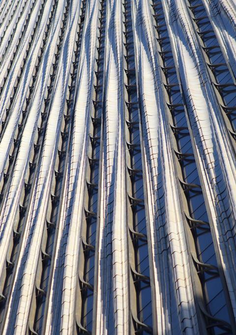
The building steps in on the south side, tapering towards a gothicky pinnacle that has clear echoes of Hugh Ferris’s atmospheric sketches. Some of the highest apartments have narrow, south facing balconies where the building steps in. Here the terracotta pilasters are terminated in finials. “We didn’t want them to just stop,” explains Getman. Between the pilasters a bronze filigree provides the decorative detail that Getman so admires in early twentieth century New York architecture.
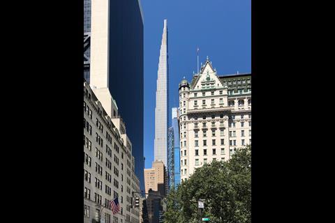
The building is something of a chameleon, presenting radically different elevations depending on from where it’s viewed. On the east and west, the white terracotta gives it a solidity and surface texture reminiscent of the earlier New York architecture that Getman so clearly admires. But on the north and south elevations, it presents as an almost sheer glass skyscraper.
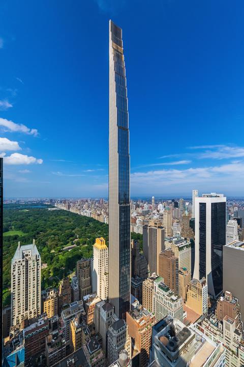
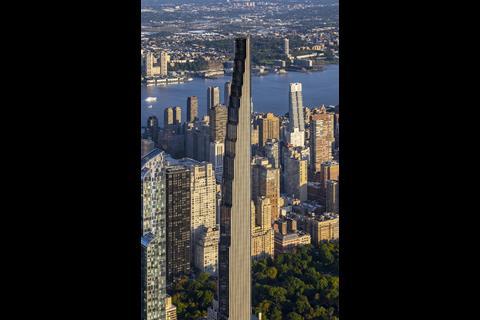
Seen from street level and a distance, it’s the glazed north and south elevations that tend to be more prominent, especially from Central Park. The rationale of keeping these elevations open for uninterrupted views makes sense, but the architectural treatment feels less convincing.
I’m inclined to feel that not carrying the terracotta treatment around all four elevations is a missed opportunity. But maybe the changing perception one has of the building as it is viewed from different angles around the city is one of its strengths.
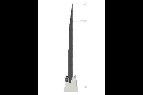
What is undeniable is the impact of its impossibly thin and elegantly tapering profile. 111 West 57th Street culminates in a gigantic, feathered top, which is unoccupied but plays a structural role in managing the wind loads. “The crown was about creating a crescendo”, says Getman.
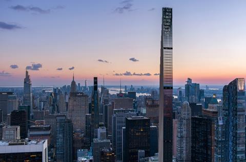
Getman sees what SHoP have done with 111 West 57th Street as part of a wider movement within New York towards rediscovering the playful iconography of those early skyscrapers. As we look south from the floor to ceiling windows of the 43rd floor, she points at Jean Nouvel’s 53 West 53 tower as an example of what other architects have been doing. “It’s exciting to see that thinking about how a building ends – the top.”
The depth of thought that has gone into the building’s impact on the skyline feels like it stands in stark contrast to the unsightly scramble for high rise dominance in London, where materiality and the all-important “top” has been almost entirely ignored amidst a glut of bland, glassy stumps.
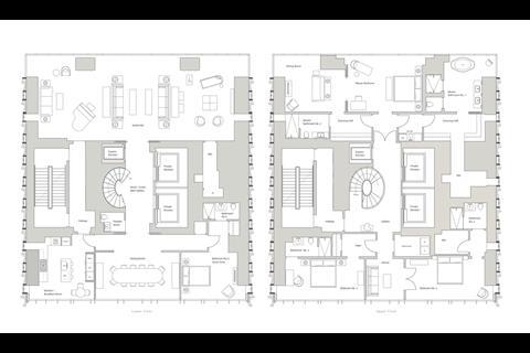
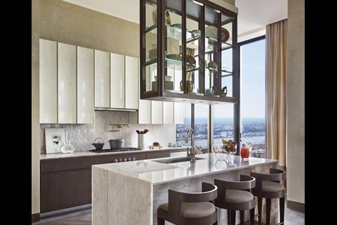
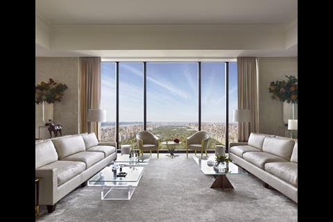
Internally, communal spaces in the building, and some of the apartment interiors, have been designed by Studio Sofield in a conservatively luxuriant style, with art deco touches. Bedrooms are mainly located on the south side of the tower, with views over Midtown, while living spaces are located to the north, looking over Central Park. The tower culminates in a series of duplexes, with lifts opening directly into the apartments.
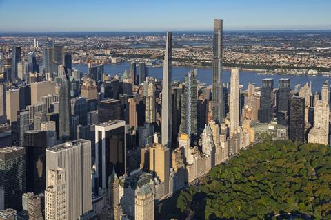
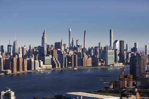
57th Street is home to a growing cluster of super tall and thin skyscrapers. The street and wider area are now commonly referred to as “Billionaire’s Row”. One57 by Christian de Portzamparc completed in 2014. Other architects to have completed residential towers nearby include Robert Stern and Rafael Vinoly.
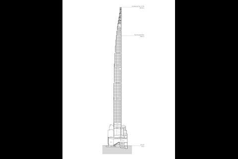
Vinoly’s 432 Park Avenue was widely admired for its elegant design and what seemed to be impossibly high 1:15 width to height ratio. 111 West 57th Street’s 435 m tower takes the slenderness ratio to 1:24, making it currently the “skinniest” skyscraper in the world. What’s driven the rise of these super thin towers in New York, is the price of land, which has become so expensive that the only way to make developments profitable is to pile the residential units up ever higher.
As WSP, the structural engineers behind the project point out, there is actually no theoretical limit to the height of a building. The only requirement is that the taller they are, the stronger and stiffer they need to be.
“It’s impossible to stop a building from moving”
The structural solution was arrived at very early on in the project and informed the design of the external envelope. There are 200 rock anchors that penetrate 30 m into the bedrock. Getman has kept a piece of the steel rebars, which are 2 inches thick at the base.
At the top of 111 West 57th Street, the air flows are comparable to those experienced by an aeroplane. Rather than preventing movement, the engineers try to control the building’s acceleration as it sways. “It’s impossible to stop a building from moving, but we can control that movement so the majority of people will not feel it,” says Silvian Marcus, director of building structures at WSP New York.
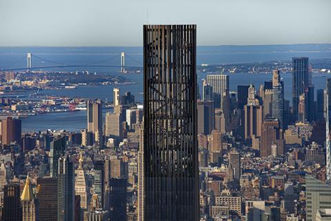
Stiffness at this height necessitates a concrete rather than steel structure. The core adds stiffness, but the extreme ratio is mainly achieved through the concrete shear walls on the east and western sides. These shear walls were what dictated that the east and west elevations would be more solid, which is why they are clad in opaque terracotta. The structural solution also allows for almost entirely uninterrupted views to the north and south, with only two relatively slender columns breaking up each of these elevations.
There are a number of other proven methods the tower adopts to cope with the huge wind loads. Floors 51, 71, and 86 contain unoccupied and that help manage the ‘vortex shedding’ that can increase acceleration in the tower’s movements. And because the wind loads are highest at the corners, these have been gently curved. There is also a tuned mass damper to help address high winds and earthquakes.
Simon Koster of the developer, JDS, describes how in New York, the structural design can be one of the first things a buyer asks about. “We’re having conversations about the structural dampener, shear walls, the overall stiffness of the building, movement, sway… All these things are… part of the residential buyer’s lexicon in New York.”
“I know what it means and how hard it is to get here, especially as a woman.”
The project has taken up almost a decade of Getman’s life. I ask her how she feels about the building now that it’s completed. She recently brought her mother and daughter to the building for Mother’s Day. “My mum was an architect in 1970s Los Angeles. It wasn’t easy,” she tells me. “It was really special to share the moment with the three generations,” she says. “I know what it means and how hard it is to get here, especially as a woman.”
Getman also describes the relationship with Michael Stern and JDS as “an incredible partnership”. But this is not a building without controversy. It was reportedly built largely with ununionised labour, in a city where there is almost unheard of. And at a time of ever-growing income disparity in the United States, this tower is an inescapably monument to wealth and status.
The cost of homes in Manhattan, has long been eye wateringly expensive. Studios in 111 West 57th Street reportedly start at $7,750,000. There is no concession here to “affordable” homes, and Getman is unforthcoming on whether there has been any off-set contribution to more affordable housing elsewhere in New York. There is an indication that she acknowledges the wider housing issue, when she tells me that she felt fortunate to be able to work for another client on a low cost housing scheme in parallel with this project.
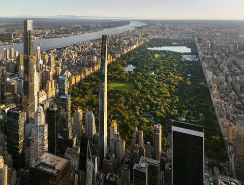
There is also little to counter those who argue that no high rise can ever be a sustainable building. Getman points to the fact that SHoP has retained the fabric of the existing Steinway Hall, with all its embodied carbon, and its very efficient floorplans, as evidence of the lengths the design team have gone to achieve sustainability. But the embodied carbon of tall structures, with their intense use of steel and concrete is inescapable.
Should architects be designing such buildings in the face of the climate emergency and gross wealth disparities? It’s a question that more and more people in the profession are asking themselves. But the reality is that many architects still aspire to work in the high-rise sector and a prestige skyscraper is a hard project to turn down.
Perhaps the most we can demand of those who design such buildings is that they try to make them as sustainable as possible. And that they conceive them with an awareness of their place on a shared and treasured skyline. In this respect, Getman and her team at SHoP have achieved their objective.
Project team
Architect: SHoP Architects
Interior designer: Studio Sofield
Structural engineer: WSP USA
Facade engineering services: Buro Happold
Developer: JDS Development Group
Downloads
111 West 57th Street_Context Plan
Other, Size 4.25 mb
















No comments yet