It has got a beauty spa, a wedding reception venue and even a honeymoon suite, but this is not a boutique hotel – it’s just the look and feel that Glasgow’s Prince & Princess of Wales Hospice was going for, writes Ike Ijeh. Photography by Keith Hunter
It is unusual for the clients of a healthcare building to insist that they “categorically did not want to appoint a healthcare architect” for their new project. But this was exactly the position taken by Glasgow’s Prince & Princess of Wales Hospice when it decided to move from its site in the centre of Glasgow to a new, yet-to-be-determined site elsewhere in the city.
“If we had hired a healthcare architect we would have got a hospital, and that wasn’t what we wanted,” hospice chief executive Rhona Baillie recalls. “We wanted a fresh pair of eyes, an architect who didn’t come with a preconceived idea of what a hospice was.
“Patient-centred care is very much a healthcare buzzword at the moment, but it’s rarely, if ever truly delivered. For us that was the absolute priority – we essentially wanted an architect and a building that knows what it’s like to be a patient.”
Prince and Princess of Wales Hospice
Bellahouston Park, Glasgow A 16-bed in-patient facility that, through outpatient care and family support, treats over 1,200 people a year
Size 7,000��²
Project value £21��
Appeal launched September 2012
�ڶ����� work started May 2015
Construction started September 2016
Patients moved in September 2018
The patient focus was perhaps particularly important because the healthcare building in question was a hospice. Hospices are often perceived as solemn and depressing places, where people live out the end of their days in clinically induced solitude. This is a perception that Ballie was determined to smash.
“People think of hospices and they think of fear. They think of separation from the community. They think of death. This is the absolute opposite of what we wanted our new building to do. There’s more life in a hospice than virtually any other kind of healthcare building – and we wanted our new building to embrace that entirely.”
The result is one of the most extraordinary reinventions of traditional healthcare typology and methodology anywhere in the UK. The £21�� Prince & Princess of Wales Hospice is a 7,000��², 16-bed in-patient facility that, through outpatient care and family support treats over 1,200 people a year, some of them as young as 16.
The look and feel we were going for is a boutique hotel
Rhona Baillie, Prince & Princess of Wales Hospice
It contains many of the facilities that one would expect of a hospice, including a multi-faith prayer sanctuary, counselling rooms, physical rehabilitation equipment and a mortuary.
Radically it also offers the UK’s first example of the Sengetun integrated healthcare model, a Nordic import which eschews a traditional ward layout in favour of a radial arrangement that promotes visual and social connectivity between patients and their families and carers.
But that is where the similarity to conventional hospice design ends because, as if to prove Ballie’s point, the hospice comes equipped with an extraordinary array of unexpected and distinctly life-affirming amenities. These include a honeymoon suite, a bustling public cafe, beauty spa, art studio, wedding reception venue, masses of soft furnishings, minimalist Scandinavian furniture and even wall-mounted fireplaces. As Ballie herself puts it, “the look and feel we were going for is a boutique hotel”.
The architect responsible for delivering all this was Ryder. It was initially appointed as Nord Architects before the latter’s 2011 split. The date reveals the longevity of the project, with construction only beginning in late 2016 and completed last year. But, according to Ryder’s architectural director Alastair Forbes, that timeframe was critical to the development of a design that fully responded to the client’s patient-focused brief. “Initially they didn’t have a site and the project effectively paused for a year in order to find one. But we took this time to really listen to the client and find out what they wanted,” Forbes says.
“It was actually quite a liberating process; architects can sometimes become consumed with responding to the site. I wouldn’t necessarily call that a constraint but not having one gave us the breathing space to respond to what the client wanted.”
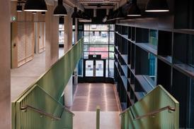
And Forbes reveals that the design team was able to form a number of key architectural responses to those client requests. “We definitely wanted a non-institutional building, a building with no corridors, one where materiality was very firmly expressed and a building that was well integrated into its landscape.”
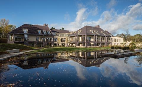
It is surrounded by new, intricately landscaped patient gardens which include fountains and a large pond
Landscape became a particularly pertinent issue when a site was eventually found. Glasgow hosts an astonishing 94 parks and Bellahouston Park to the south-west of the city is one of its most lovely.
The hospice has been built on the site of a former nursery donated by the city council. It is surrounded by new, intricately landscaped patient gardens which include fountains and a large pond. “As many people approach the end of their lives they feel a heightened connection with nature,” Baillie explains. “Accommodating that was extremely important to us.”
Overlooked by a conservation area that includes a number of handsome 19th-century villas and a replica of a Charles Rennie Mackintosh mansion, the site also came with heritage sensitivities that chimed with the more domesticated and less institutionalised feel that both architect and client wanted. The result is a cluster of four conjoined brick villas surmounted by a series of swooping pitched roofs. These are all clad in a patinated purple Welsh slate that provides a softer version of the black slate roofs on surrounding conservation area buildings.
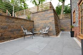
Due to the sloping hill on which the building is constructed, it is variously configured as a two and three-storey building, with the partially submerged lowest floor cleverly exposed as a number of sunken courtyards.
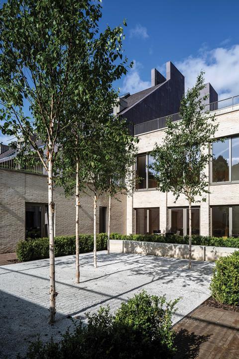
Breaking down the scale and mass of this large building into smaller, partially concealed blocks conspicuously expressed on residential rather than institutional lines was key to constructing a more intimate and informal hospice facility. The language of domesticity is also reinforced through the use of chimneys, dormers and gables.
Even the front door from the Georgian terrace that the hospice previously inhabited in Carlton Place has been relocated. Materiality plays a hugely important role in this too. The exterior is clad in a warm-coloured handmade brick that gives the building a soft, mellow skin.
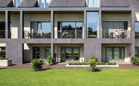
But this brickwork is often set behind broad verandas that enwrap much of the envelope and ensure that every patient room has access to generous terrace or balcony space. The external fascia of the veranda is then clad in the same slate as the pitched roof, adding a sequence of material contrasts that help dilute scale and mass further. It also fits the intimacy agenda by allowing, as Forbes point out, the roof to almost extend “protective arms” around the building.
We wanted the architecture to take the fear out of a hospice
Alastair Forbes, Ryder Architecture
It is indicative of the design team’s wide approach to the building, as Forbes explains. “We wanted the architecture to take the fear out of a hospice. We wanted somewhere warm and welcoming, intimate and domesticated.”
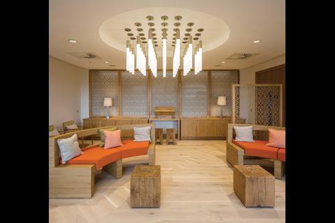
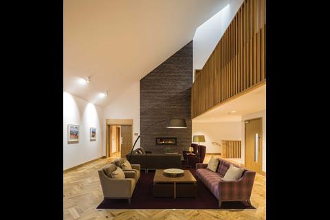
If anything, this theme accelerates once inside. Rather than an entrance desk, an informal pale beech table greets visitors, exuding the warm retro lines and minimalist finish that generally characterises the interiors.
Beyond here sits a lounge area with a sleek wall-mounted fireplace and complete with brightly coloured sofas and cushions. While the furnishings obviously set out the building’s domestic intention, they also indicate the degree to which it was prepared to push regulations in order to achieve its vision of patient-centred care.
Soft furnishings are prohibited from public areas of many healthcare building in order to minimise the risk and spread of infection which can sit undetected in textile pores. But, led by Baillie, the design team challenged this assumption. Baillie argued that the prohibition was more likely to have been generated by staff maintenance and resourcing constraints and that new fabric technologies minimised the transfer of infection.
The result is an interior that abounds with soft furnishings, from quilted alcoves cut into walls to a profusion of cushions of soft padded surfaces and fittings in bereavement and counselling suites. It may seem a small decorative gesture but it is critical in establishing the overarching theme of residential domesticity that the brief demanded.
The cafe is not just enjoyed by patients and their families but by members of the public completely unconnected to the hospice
Beyond the lounge sits a cafe, again warmly appointed with Scandinavian-inspired furniture, timber finished on walls and subtle lighting, themes evident throughout the interior.
The hospice has been overwhelmed by the success of the cafe as it is actively used not just by patients and their families but by members of the public completely unconnected to the hospice. Both Forbes and Baillie see it as a strong social vindication of their approach and a central facet of placing the hospice firmly in the middle of the community.
In fact, the only clues to the building’s function are the oxygen tank inlet sockets discreetly embedded into walls and underneath tables. “They’re everywhere throughout the building,” Baillie says proudly. “It enables patients to have the confidence to move anywhere throughout the building and to know that they don’t need to be confined to their rooms.”
The in-patient rooms in question are arranged over the two lower floors, while office, administration space and venue hire accommodation is situated on the top floor. The rooms are based on the Sengetun model which means they are clustered on all four sides of two large lobbies with a nurse’s station at the centre. As all the rooms have glass doors, this arrangement not only allows the staff to monitor patients in their rooms but gives patients the vital assurance of a direct visual connection to staff.
The hospice has adapted the Sengetun model slightly so that the nurse sits at the table in the lobby, with more clinical apparatus concealed in side areas, again stressing the residential feel.
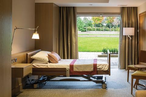
Patient choice is a critical part of the Sengetum and the hospice’s approach, and the room layouts themselves are designed to optimise this. Within the rooms, beyond the glass door is a nurses’ area where staff can run diagnostics and dispense medication, all of which is discreetly concealed within sleek integrated timber cabinets. When their doors are closed, the thematic emphasis is, again, one of minimalist Scandinavian domesticity.
Beyond this zone lies the patient area, with a bed, seating, access to an en-suite bathroom and generous floor-to-ceiling glass doors that provide access to either the terrace or balcony. A curtain can separate the patient area from the nurses’ diagnostic area so, when a patient requires privacy, they need not be overlooked by the nurses’ station outside. Moreover, to underline the principle of choice, everything from the operation of the curtains to lighting and TV can be remote-controlled by the patient themselves.
Project team
Architect Ryder Architecture
Main Contractor Balfour Beatty
Structural Engineer Woolgar Hunter
M&E Engineer Atelier Ten
Landscape Architect ERZ
Project Manager Turner & Townsend
A hospice has a huge number of varying types of accommodation, ranging from patient rooms to clinical areas to rooms where news of bereavement can be broken to young children. Forbes identifies managing these adjacencies as one of the most challenging parts of the project.
“Handling patient flows was critical. There are family areas or areas for young children that we wouldn’t necessarily want next to clinical areas, so we had to think very carefully about layouts and ensure that we created adjacencies that did not cause problems with each other.
“The soft furnishings are actually part of the strategy. Wherever you are in the building, every 20 or 25 metres, there’s somewhere to sit so that you can always gather yourself or collect your thoughts.”
It is fitting that one of the most convincing testimonies of its impact comes from a patient themselves
If the Prince & Princess of Wales Hospice represents design delivering a more human, domesticated and less intimidating form of hospice building for one of the most difficult periods in human life, then that is something to not only be welcomed but conveyed to as many other healthcare institutions as possible. And for a building so focused on the patient experience, it is fitting that one of the most convincing testimonies of its impact comes from a patient themselves.
Forbes recalls a young mother who was admitted to the hospice after learning that she had terminal cancer. She engaged with the art studio as part of her therapy and painted a picture of a howling wolf menacing a door. Within weeks she was painting pictures of sunlit landscapes.
Hospices cannot prevent death and, as this one’s own literature states, they cannot add days to life. But good, human-focused design proves that you can add life to days.









No comments yet