Traer-Clark, the architect of the £2.7m conversion, followed Herzog & de Meuron's strategy at the Tate Modern: keep the dramatic external shell, and clear out the turbines and boilers to create a soaring internal space.
The building is brick-block modernism at its most unaccommodating: just a rectangular box set on its end with a 150-foot chimney sprouting from the centre of the roof. It looks like a towering Cyclops about to reach down to snack on one of the bungalows at its feet.
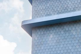
This exterior has been kept largely intact, although the long metal-framed windows that previously rose up the lower floors have been matched higher up. The only other external change is the addition of subtle penthouse apartments on the low-rise blocks fringing the main tower. These are made of lightweight aluminium with foldable screen walls.
Most of the work of the conversion was in eviscerating the building's nine floors of their boilers, pumps and oil stacks, then redesigning them as vast, split-level, loft-style apartments. Architect George Traer-Clark says: "We looked at the spaces inside and thought about how best to use these 5 and 6 m high voids. We ended up putting the apartments in upside-down, with bedrooms at the bottom and high-ceilinged living spaces above."
The apartments are reached through a communal entrance space that has been carved out of the heart of building. Here, the roof has been taken off the machine hall to create an open courtyard, now painted in sassy blue and red. The original chimney flue remains a centrepiece, but also works as the building's main lift access until it reaches the penthouse, whereupon it becomes an enormous shower room. Wrapped around this thick concrete tube is a steel spiral staircase with wire grid balustrades, designed to match the building's grungy aesthetic.
"We wanted to keep the raw industrial spirit alive," says Kirk Pickering of developer Square Foot. "We also preserved the bare concrete and steel ceiling grids and left structural beams exposed." These features have then been set against slicker contemporary detailing so that this wild old power station is, as Pickering puts it, "tame enough to live in".
Credits
client/developer Square Foot architect Traer-Clark contractor Sindall structural engineer Richard Jackson Partnership building services Neuhartt QS Dudley Smith Partnership windows Senlec


