Mass StudiesŌĆÖ innovative design for this yearŌĆÖs Serpentine Pavilion, engineered by Aecom, reimagines traditional concepts, blending contextual sensitivity with conceptual boldness, writes Ben Flatman
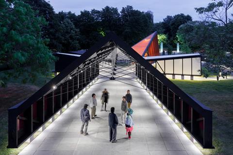
This yearŌĆÖs Serpentine Pavilion has been designed by Mass Studies, the South Korean practice founded by Minsuk Cho. In a break from previous incarnations, rather than having a primary large space with a loosely defined purpose, ChoŌĆÖs concept seeks to provide an explicit programme of uses for the five distinct modules that are ranged around its central courtyard.
These include a ŌĆ£tea houseŌĆØ, auditorium-cum-great hall, acoustic installation, ŌĆ£play towerŌĆØ and a library of ŌĆ£unread booksŌĆØ.
The result is a little like entering an exploded diagram, with the five rooms seemingly straining to escape each otherŌĆÖs gravitational pull. While a circular open-air ŌĆ£madangŌĆØ (Korean for ŌĆ£yardŌĆØ) imposes a formal order on the overall composition, it has a tension that pulls and pushes the visitor between the varied sensory experiences within each of these five ŌĆ£content machinesŌĆØ.
Cho tells ║┌Č┤╔ńŪ°ŌĆÖs sister title ║┌Č┤╔ńŪ° Design that the timber-framed pavilion seeks to blend a contextual approach with the more wilful imposition of an almost site-defying concept. ŌĆ£Sometimes I come up with some ideas and then go to the site and realise itŌĆÖs completely the wrong idea,ŌĆØ Cho explains.
ŌĆ£But itŌĆÖs always good to have the conceptual and contextual ŌĆō the two things together.
ŌĆ£In architecture weŌĆÖve somehow had this very oppositional position created. The idea that mediocre contextual architects respect things too much, and that then there are these brave, brilliant inventors ŌĆō geniuses - that come up with the conceptual stuff.
ŌĆ£I was always thinking, why canŌĆÖt we have those two approaches at the same time?ŌĆØ
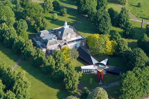
Cho manages this balancing act partly by treating the grounds of the Serpentine as an archaeological site, rich with its own history, left by the imprint of past pavilions.
The practice began its design process by looking back at all of the 22 structures that had been built on the site previously. They mapped the locations of the earlier iterations, to gain an understanding of how the other architects had responded (or not) to the gently sloping topography and context.
Cho was also keen to develop a critique of what a pavilion could be, drawing inspiration from traditional Korean culture to inform the practiceŌĆÖs approach. Moving beyond what he sees as the European idea of the pavilion as a folly that is intent on creating a ŌĆ£complete or exotic worldŌĆØ within the landscape, Cho wanted to instil the qualities of a Korean pavilion ŌĆō a more modest structure responsive to place and focused on cultural production.
He also describes the Korean pavilion as a ŌĆ£fingerŌĆØ that ŌĆ£pointsŌĆØ towards the landscape, highlighting what is already there, rather than drawing attention to itself.
ŌĆ£It was interesting that, in my tradition, a pavilion was a genre that really grew out of the surroundings,ŌĆØ he says. ŌĆ£ItŌĆÖs more about the discovery ŌĆō you have a beautiful rock, beautiful scenery. ThatŌĆÖs what you built this thing from. Architecture is not really the purpose.
ŌĆ£The Korean pavilion is also associated with literary activity,ŌĆØ Cho explains. ŌĆ£ItŌĆÖs for writing poetry and practising calligraphy.ŌĆØ
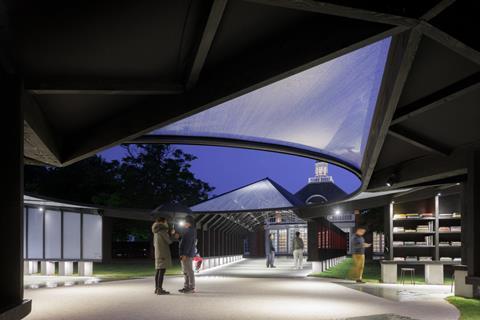
As the main entrance to the pavilion, the Gallery hosts a six-channel sound installation by musician and composer Jang Young-Gyu, featuring ŌĆ£The Willow is in the SummerŌĆØ and ŌĆ£Moonlight in the AutumnŌĆØ. Drawing inspiration from the pavilionŌĆÖs surroundings, Jang combines sounds from nature and human activities recorded in Kensington Gardens with traditional Korean vocal music and instruments. The tones and melodies are intended to reflect the changing seasons and the evolving landscape of the park.
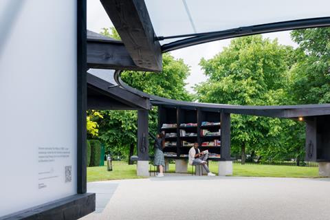
To the north is ŌĆ£The Library of Unread BooksŌĆØ by artist Heman Chong and archivist Ren├®e Staal. This artwork serves as a living reference library, with each book donated by its previous owner to create a shared pool of knowledge. Visitors are invited to contribute their own unread books to the growing collection.
Cho tells BD that this part of the pavilion is partly inspired by a wave of new small libraries in parks that have sprung up in Korea. ŌĆ£TheyŌĆÖve become very popular,ŌĆØ he explains. ŌĆ£Almost like an antidote to what is often seen as this digitally fatigued society.ŌĆØ
Acknowledging the history of the Serpentine Gallery building, the Tea House is situated to the east of the pavilion. The Serpentine South building was designed by James Grey West, and opened in 1934 as a teahouse, operating in this capacity until the early 1960s before reopening as an art gallery in 1970.
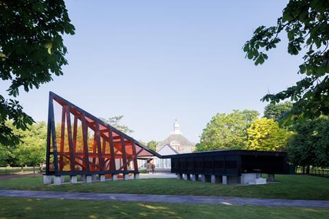
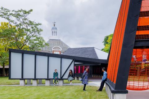
The Pavilion also includes the Play Tower, a pyramid structure equipped with a bright orange netscape, offering a playful area that is a welcome gesture towards the many children ŌĆō or just young at heart ŌĆō who visit each year.
To the west lies the Auditorium, the largest of the five ŌĆ£islandsŌĆØ. This space, with its inner walls featuring built-in benches, is designed for public gatherings and will host a variety of performances and talks.
It is oriented directly towards the western elevation of the Serpentine Gallery, responding to the permanent building in a way that few previous architects have attempted. It frames a view of the gallery, helping to ground the pavilion in its location and inviting a more direct relationship between the permanent institution and the temporary installation.
It is an attempt at the beginning of an architectural and conceptual dialogue about the meaning and purpose of the pavilion that seems long overdue.
The pavilion has again been engineered by Aecom, with Jon Leach, the practiceŌĆÖs director of buildings and places, returning to oversee the structural design. ŌĆ£It was very different to previous pavilions which had all essentially been one object,ŌĆØ Leach explains. ŌĆ£Here, we were basically designing five very different buildings.
ŌĆ£ItŌĆÖs made from natural, relatively green timber, which brings its own set of challenges. Compared to glulam, it has got lower strength and lower stiffness, so you need more of it.ŌĆØ
Although the Douglas fir ŌĆō stained black throughout - has all been sourced from Surrey, it is used in a way that deliberately evokes traditional Korean architecture. Mass Studies had originally hoped to utilise Korean joinery details, but time ŌĆō and UK ║┌Č┤╔ńŪ° Regulations ŌĆō apparently led to the adoption of largely steel joints throughout.
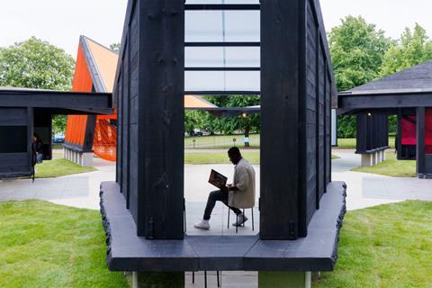
A ŌĆ£live edgeŌĆØ has been created by leaving the bark on the timber at a constant height around all five structures, around 50cm from the ground. It adds a rustic touch that speaks to the very postmodern, magpie-like conceptual approach that underpins the design.
Cho himself at one point references Gottfried SemperŌĆÖs Four Elements of Architecture, and the Primitive Hut, as underyling reference points.
>> Also read:
>> Also read:
The Serpentine has been criticised in the past for what at times has felt like a slightly meaningless parade of big-names stars, dropping in to deliver one-liner buildings that sometimes felt like they had been dialled in on autopilot. Cognisant of that criticism, the Serpentine has made an effort in recent years to commission younger, hungrier and perhaps more interrogative architects, delivering a string of more potent pavilions.
The Serpentine and Mass Studies have rightly decided that some critical pushing at the boundaries of the brief was required. ChoŌĆÖs contribution here points towards interesting new opportunities to perhaps delve even deeper into the relationships between client, site and architect.
Only by adopting such an an-going critique can the pavilion retain its relevance.







No comments yet